

Aggregate metrics hide important trends. "10,000 deep link clicks this month" tells you nothing about whether the users who clicked are retaining, converting, or churning. Cohort analysis solves this by grouping users who share a common trait (typically their acquisition date or source) and tracking their behavior over time.
This guide covers cohort analysis for deep link performance. For deep link analytics broadly, see deep link analytics: measuring what matters. For conversion funnel analysis, see conversion funnel analysis for deep links.
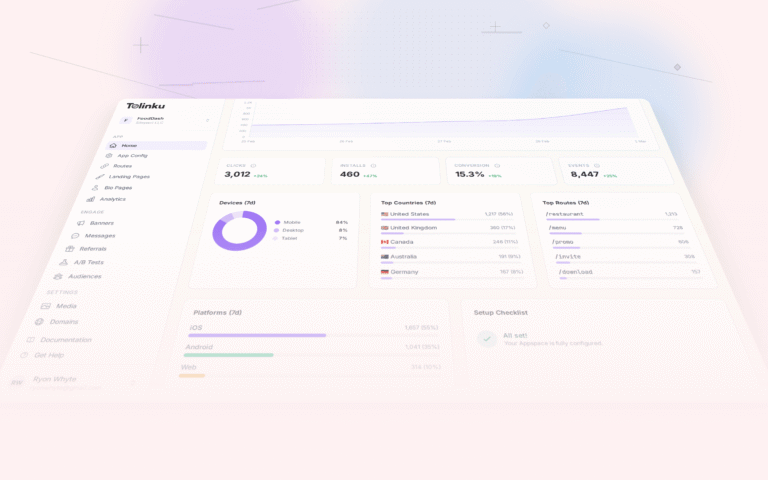
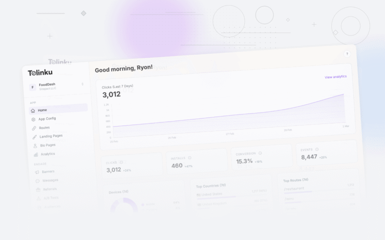
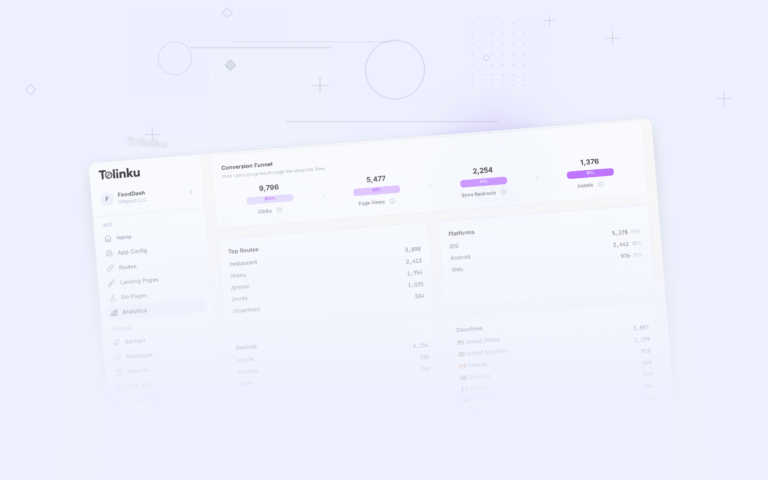
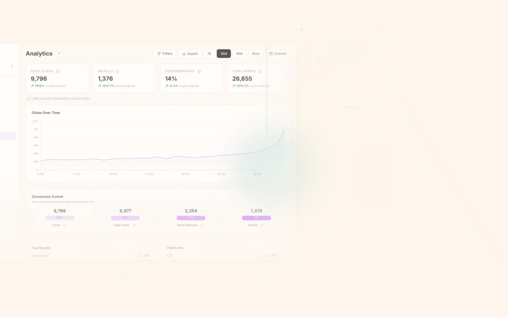
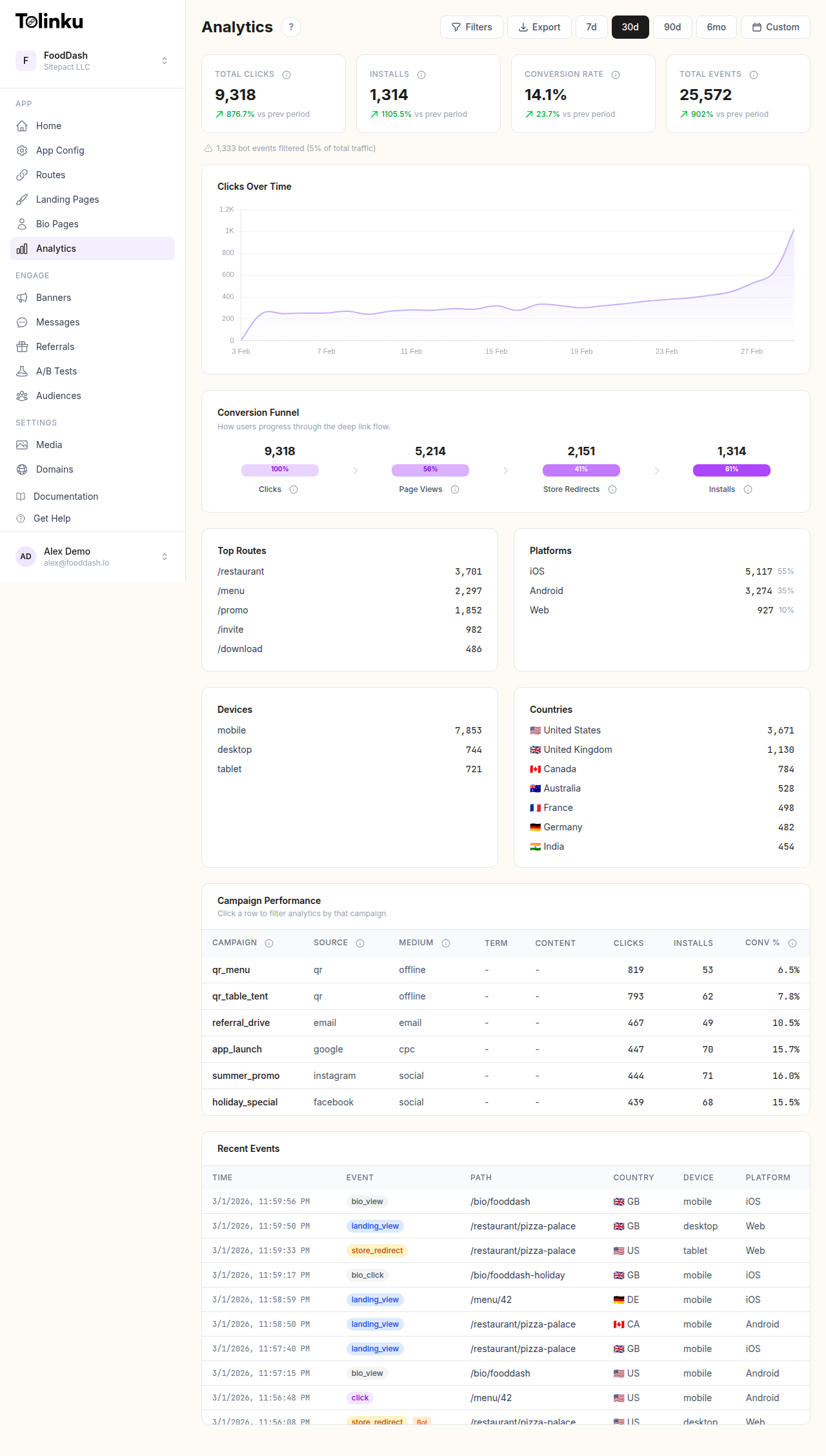 The analytics dashboard with date range selector, filters, charts, and breakdowns.
What Is Cohort Analysis
A cohort is a group of users who share a characteristic. The most common cohort type is an acquisition cohort: all users who installed in the same week or month.
Acquisition Cohort Example
Users who clicked a deep link and installed in Week 1 of July vs Week 2:
| Cohort | Installs | D1 Retention | D7 Retention | D30 Retention | Revenue/User |
|---|---|---|---|---|---|
| Jul W1 | 2,400 | 45% | 28% | 15% | $3.20 |
| Jul W2 | 2,800 | 42% | 25% | 12% | $2.80 |
| Jul W3 | 3,100 | 48% | 32% | 18% | $4.10 |
Week 3 had the highest quality users despite not having the most installs. Something changed (maybe a new campaign, creative, or targeting) that improved quality.
Source Cohort Example
Group by the deep link source instead of date:
| Source | Users | D7 Retention | D30 Retention | Conversion Rate | Revenue/User |
|---|---|---|---|---|---|
| Email campaign | 1,200 | 38% | 20% | 8.5% | $4.50 |
| Push notification | 3,500 | 30% | 14% | 5.2% | $2.80 |
| Social share | 800 | 42% | 25% | 10.1% | $5.20 |
| QR code | 400 | 35% | 18% | 7.0% | $3.60 |
Social share users have the highest retention and revenue, even though push notifications drive the most volume.
Retention Cohort Heatmap
The retention heatmap is the most common cohort visualization. Each row is a cohort (week), each column is a time period after acquisition, and the cell value is the retention rate:
          Week 0   Week 1   Week 2   Week 3   Week 4   Week 5
Jun W1    100%     35%      22%      18%      15%      13%
Jun W2    100%     38%      25%      20%      17%      15%
Jun W3    100%     33%      20%      16%      13%      11%
Jun W4    100%     40%      28%      23%      19%      17%
Jul W1    100%     42%      30%      24%      -        -
Jul W2    100%     36%      24%      -        -        -
Reading this heatmap:
- Jun W4 has the best retention curve. Something improved that week.
- Jun W3 has the worst retention. Investigate what changed.
- Jul W1 and W2 show continued improvement.
Building the Heatmap
SELECT
  DATE_TRUNC('week', u.install_date) AS cohort_week,
  FLOOR(EXTRACT(EPOCH FROM (e.event_date - u.install_date)) / 86400 / 7) AS weeks_since_install,
  COUNT(DISTINCT u.user_id) AS cohort_size,
  COUNT(DISTINCT e.user_id) AS active_users,
  ROUND(COUNT(DISTINCT e.user_id)::DECIMAL / COUNT(DISTINCT u.user_id) * 100, 1) AS retention_pct
FROM users u
LEFT JOIN events e ON u.user_id = e.user_id
  AND e.event_type = 'app_open'
WHERE u.install_date >= '2026-06-01'
GROUP BY cohort_week, weeks_since_install
ORDER BY cohort_week, weeks_since_install;
Deep Link Cohort Dimensions
By Deep Link Route
Group by the route the user first entered through:
| First Deep Link Route | Users | D7 Active | Conversion |
|---|---|---|---|
/products/{id} |
3,200 | 32% | 6.5% |
/offers/{id} |
1,800 | 28% | 12.0% |
/referral/{code} |
900 | 45% | 9.0% |
/ (home) |
5,000 | 22% | 3.0% |
Users who enter through a specific product or offer page have higher conversion than those who land on the home screen. Referral users have the highest retention.
By Campaign
SELECT
  dl.utm_campaign,
  COUNT(DISTINCT dl.user_id) AS users,
  ROUND(AVG(CASE WHEN e.d7_active THEN 1 ELSE 0 END) * 100, 1) AS d7_retention,
  ROUND(AVG(CASE WHEN e.d30_active THEN 1 ELSE 0 END) * 100, 1) AS d30_retention,
  ROUND(SUM(r.revenue) / COUNT(DISTINCT dl.user_id), 2) AS revenue_per_user
FROM deep_link_clicks dl
LEFT JOIN user_engagement e ON dl.user_id = e.user_id
LEFT JOIN revenue r ON dl.user_id = r.user_id
  AND r.event_date <= dl.click_date + INTERVAL '90 days'
WHERE dl.click_date >= '2026-06-01'
GROUP BY dl.utm_campaign
ORDER BY revenue_per_user DESC;
By Device/Platform
| Platform | Users | D7 Retention | Conversion | Revenue/User |
|---|---|---|---|---|
| iOS | 4,500 | 35% | 8.0% | $4.80 |
| Android | 6,200 | 28% | 5.5% | $3.20 |
| Web (fallback) | 1,800 | 15% | 2.0% | $1.50 |
iOS users from deep links tend to retain and convert at higher rates. Web fallback users (who did not have the app) convert at much lower rates, highlighting the importance of app installation.
Revenue Cohort Analysis
Track cumulative revenue per user cohort over time:
Cumulative Revenue Per User (by install week):

          Month 0   Month 1   Month 2   Month 3   Month 6   Month 12
Jan W1    $0.50     $2.10     $3.40     $4.50     $7.20     $11.00
Feb W1    $0.60     $2.30     $3.80     $5.00     $8.10     -
Mar W1    $0.45     $1.90     $3.10     $4.20     -         -
Apr W1    $0.70     $2.50     $4.00     -         -         -
This view shows whether user quality is improving or declining over time. Apr W1 has the highest early revenue, suggesting improving acquisition quality.
Implementing Cohort Analysis
Data Model
interface CohortConfig {
  dimension: 'install_date' | 'source' | 'campaign' | 'route' | 'platform';
  granularity: 'day' | 'week' | 'month';
  metrics: ('retention' | 'revenue' | 'conversion' | 'engagement')[];
  dateRange: { start: string; end: string };
  periods: number; // How many periods to track (e.g., 12 weeks)
}

async function buildCohortReport(config: CohortConfig): Promise<CohortReport> {
  const cohorts = await getCohorts(config.dimension, config.granularity, config.dateRange);

  for (const cohort of cohorts) {
    for (let period = 0; period < config.periods; period++) {
      for (const metric of config.metrics) {
        cohort.periods[period][metric] = await calculateMetric(
          cohort.userIds,
          metric,
          cohort.startDate,
          period,
          config.granularity
        );
      }
    }
  }

  return { config, cohorts };
}
Visualization
function renderRetentionHeatmap(report: CohortReport): string[][] {
  const rows: string[][] = [];

  // Header row
  const header = ['Cohort', ...Array.from({ length: report.config.periods }, (_, i) =>
    `${report.config.granularity === 'week' ? 'W' : 'M'}${i}`)];
  rows.push(header);

  // Data rows
  for (const cohort of report.cohorts) {
    const row = [cohort.label];
    for (let p = 0; p < report.config.periods; p++) {
      const value = cohort.periods[p]?.retention;
      row.push(value !== undefined ? `${value.toFixed(1)}%` : '-');
    }
    rows.push(row);
  }

  return rows;
}
Actionable Insights from Cohorts
Identifying Quality Changes
If D7 retention drops from 35% to 25% between consecutive cohorts, investigate:
- Did targeting change?
- Was a new creative introduced?
- Did onboarding change?
- Was there a bug in a new app version?
Optimizing Channels
If email deep link cohorts consistently outperform push notification cohorts, shift budget toward email or investigate why push users have lower quality.
Predicting LTV
Early cohort behavior (D1, D3, D7 retention and revenue) predicts long-term value. Build models that use early cohort data to project D90 and D365 LTV.
Tolinku for Cohort Analytics
Tolinku's analytics support cohort analysis through click and conversion tracking by source, campaign, and route. Build cohort charts and funnels in the Tolinku dashboard.
For deep link analytics, see deep link analytics: measuring what matters. For app growth metrics, see app growth metrics: the 15 KPIs that matter.
Get deep linking tips in your inbox
One email per week. No spam.