A QR code is only useful if people actually scan it. Yet most QR codes are thrown onto marketing materials as an afterthought: a tiny black-and-white square crammed into a corner with no context. The result is predictably low scan rates.
Good QR code design follows a set of principles that balance technical scannability with visual appeal. This guide covers the most impactful design decisions you can make, from color and sizing to logo placement and error correction.
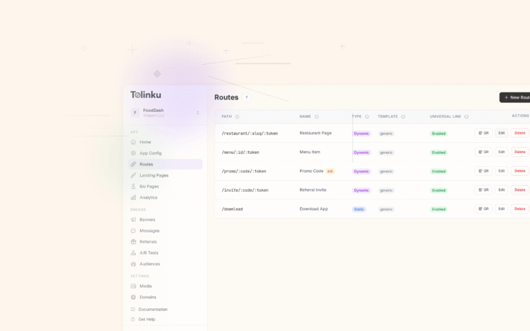
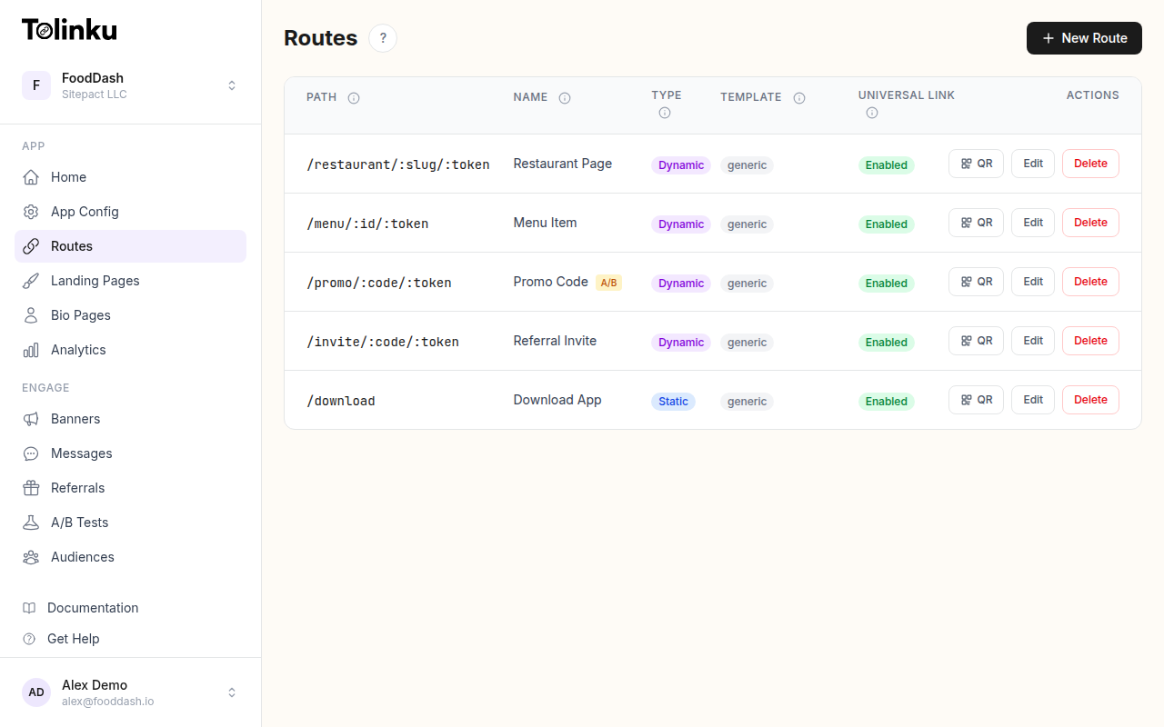 Tolinku route configuration with QR code generation for each deep link.
1. Size Matters More Than You Think
The most common QR code mistake is making it too small. Camera autofocus, viewing distance, and print resolution all affect scannability.
Minimum sizes by context:
| Placement | Minimum Size | Why |
|---|---|---|
| Business card | 2 cm (0.8 in) | Close viewing distance compensates |
| Flyer or brochure | 3 cm (1.2 in) | Arm's length scanning |
| Poster (indoor) | 5 cm (2 in) | 1-2 meter viewing distance |
| Billboard or signage | 15+ cm (6+ in) | 3+ meter viewing distance |
| Digital screen | 150+ pixels | Screen resolution varies |
The general rule: for every 10 cm (4 inches) of scanning distance, add 1 cm (0.4 inches) to the QR code size. A code that will be scanned from 1 meter away should be at least 10 cm across.
The Quiet Zone
Every QR code needs a clear margin around it called the "quiet zone." This is the white (or light-colored) border that separates the code from surrounding content. The ISO 18004 standard specifies a minimum quiet zone of 4 modules (the individual squares that make up a QR code).
In practice, this means leaving at least 2-3 mm of clear space around the code. Crowding other design elements right up to the edge of the code is one of the fastest ways to make it unscannable.
2. Color: Contrast Is King
QR codes work because scanners detect contrast between the dark "modules" and the light background. The higher the contrast, the more reliably the code scans.
Safe Color Choices
- Best: Dark foreground on light background (black on white is optimal)
- Good: Dark blue, dark green, or dark red on white or very light backgrounds
- Risky: Medium-contrast combinations like grey on light grey
- Broken: Light foreground on dark background (inverted codes), yellow on white, or low-contrast pastel combinations
Never Invert the Colors
Traditional QR code scanners expect dark modules on a light background. While modern smartphone cameras can handle inverted codes (light on dark), older devices and many third-party scanning apps cannot. Always keep the foreground darker than the background.
Brand Colors Work (With Caution)
You can absolutely use your brand colors in QR codes, but maintain a contrast ratio of at least 4:1 between the foreground modules and the background. Use the WebAIM Contrast Checker to verify your color combination meets this threshold.
For example, if your brand color is a medium blue (#3B82F6), it works well as a foreground on white. But it would fail as a foreground on light blue (#DBEAFE) because the contrast is too low.
3. Logo Embedding Done Right
Adding a logo to the center of a QR code is popular for branding, but it needs to be done carefully to avoid breaking scannability.
How It Works
QR codes include built-in redundancy called error correction. This means a percentage of the code can be obscured or damaged and the code will still scan. There are four error correction levels:
| Level | Data Recovery | Logo Space |
|---|---|---|
| L (Low) | ~7% | Too small for logos |
| M (Medium) | ~15% | Small logos possible |
| Q (Quartile) | ~25% | Recommended for logos |
| H (High) | ~30% | Best for logos |
Best Practices for Logos
- Use error correction level H when embedding a logo. This gives you up to 30% of the code area for the logo while maintaining scannability
- Keep the logo under 20% of the total code area, even with level H. The remaining error correction capacity acts as a safety margin
- Use a simple, high-contrast version of your logo. A detailed full-color logo won't be visible at QR code sizes anyway
- Place the logo in the exact center. QR codes have alignment patterns in three corners; the center is the safest area to obscure
- Add a small white border around the logo to separate it from the surrounding modules
When to Skip the Logo
If the QR code will be very small (under 3 cm), skip the logo entirely. At small sizes, the logo becomes indistinguishable and only hurts scannability. The brand recognition should come from the surrounding design context, not from a tiny logo inside the code.
4. Context and Call-to-Action
A QR code without context is a QR code that won't be scanned. Users need to know:
- That it's scannable (not just a decorative element)
- What happens when they scan it
Always Add a CTA
Include a clear call-to-action near the QR code:
- "Scan to download the app"
- "Scan for 20% off your first order"
- "Scan to view the menu"
- "Scan to join our referral program"
The CTA should be specific about the benefit. "Scan me" is better than nothing, but "Scan for a free trial" gives users a reason to act.
Visual Cues
Add visual indicators that reinforce scannability:
- A small phone icon pointing at the code
- An arrow indicating where to scan
- A frame or border that draws attention to the code
These cues are especially important on digital screens where users might not immediately recognize a QR code as interactive.
5. Dynamic QR Codes vs. Static
A static QR code encodes a fixed URL directly into the code pattern. Once printed, it can never change. A dynamic QR code encodes a short redirect URL that points to a destination you can update at any time.
Why Dynamic Codes Are Almost Always Better
- Changeable destinations: Update where the code points without reprinting
- Shorter URLs mean simpler codes: Fewer modules, easier to scan, more room for logos
- Built-in analytics: Track scan counts, locations, devices, and times
- Expiration support: Deactivate codes after a campaign ends
With Tolinku's QR code feature, every route automatically gets a downloadable QR code. The code points to your branded short link, which you can reconfigure at any time. See QR Codes in the docs for setup details.
When Static Codes Make Sense
Static codes are appropriate when the destination will genuinely never change: a link to your app store listing, a permanent product page, or a WiFi network login. For everything else, use dynamic codes.
6. Print-Specific Considerations
QR codes on physical materials face challenges that digital codes don't.
Resolution
Print QR codes at a minimum of 300 DPI (dots per inch). Lower resolutions cause the module edges to blur, reducing contrast and scannability. Always export your QR code as a vector format (SVG or PDF) if possible, so it scales cleanly at any print size.
Surface and Material
- Glossy surfaces can cause glare that interferes with scanning. If printing on glossy paper or packaging, test under different lighting conditions
- Curved surfaces (bottles, cans, tubes) distort the code. Increase the size by 20-30% to compensate for curvature
- Textured surfaces (embossed, fabric, rough paper) can break up module edges. Use thicker modules and higher error correction
Ink and Substrate Contrast
The contrast between the printed ink and the underlying material must be high enough for scanning. Dark ink on kraft paper (brown cardboard) can be problematic because the contrast is lower than dark ink on white paper. Test before committing to a print run.
7. Digital Display Best Practices
QR codes displayed on screens (websites, apps, presentations, digital signage) have their own considerations.
Screen Brightness
Screens emit light, which can wash out the contrast between modules. Ensure the code is displayed at full brightness with a solid (non-transparent) background. Avoid placing QR codes over busy backgrounds or images.
Responsive Sizing
On websites, make sure the QR code renders at a fixed minimum pixel size regardless of screen width. A QR code that shrinks to 80 pixels on mobile is unscannable. Set a CSS min-width of at least 150 pixels.
Avoid Screenshots of QR Codes
When users screenshot a QR code and share it, image compression can degrade the code. If your QR codes will be shared digitally, generate high-resolution versions and provide a download link rather than relying on screenshots.
8. Testing Before Launch
Never deploy a QR code without testing it on multiple devices.
Testing Checklist
- Scan with the default camera app on iOS (latest and one version back)
- Scan with the default camera app on Android (at least two different manufacturers)
- Scan at the expected viewing distance
- Scan under the expected lighting conditions (indoor, outdoor, low light)
- If printed, scan from the actual printed material (not just the digital proof)
- Verify the destination URL loads correctly after scanning
- Test the fallback experience for desktop users who navigate to the URL manually
Common Scan Failures
If your code won't scan, check these in order:
- Quiet zone: Is there enough margin around the code?
- Size: Is the code large enough for the scanning distance?
- Contrast: Is the foreground/background contrast ratio at least 4:1?
- Logo coverage: Is the logo covering more than 20% of the code area?
- Error correction: Is it set to H if a logo is present?
- Print quality: Are the module edges sharp and well-defined?
Putting It Together
The best QR codes combine technical scannability with smart design. Use adequate sizing, high contrast colors, appropriate error correction, and always include a clear call-to-action. For dynamic campaigns, use a platform that gives you changeable destinations and scan analytics.
For a broader overview of how QR codes and short links fit into mobile marketing strategy, see QR Codes and Short Links for Mobile Apps.
Get deep linking tips in your inbox
One email per week. No spam.