

Tables tell you the numbers. Heatmaps tell you the patterns. A geographic heatmap instantly shows that your campaign is performing well in coastal US cities but failing in the Midwest. A time-based heatmap reveals that your push notification deep links get the most engagement at 8am and 6pm. These patterns are invisible in raw data.
This guide covers heatmap visualizations for deep link analytics. For geographic analytics, see geographic analytics for deep link campaigns. For visualization techniques, see visualizing deep link data: charts and dashboards.
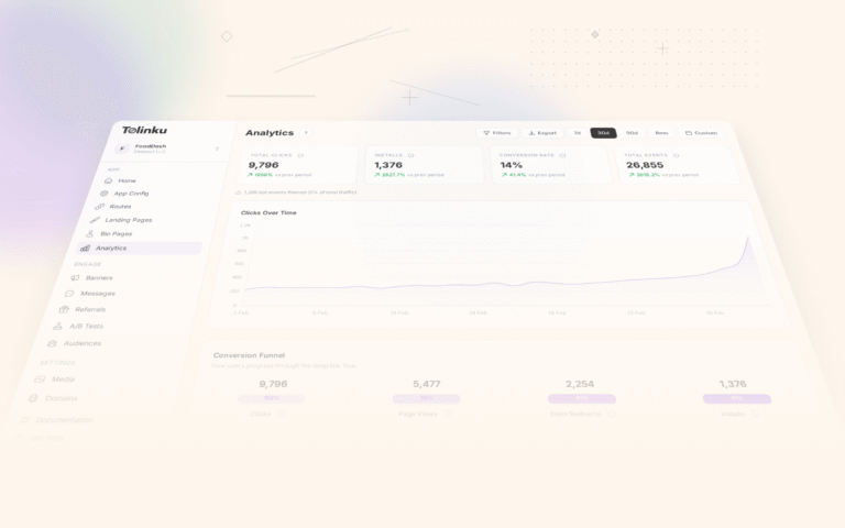
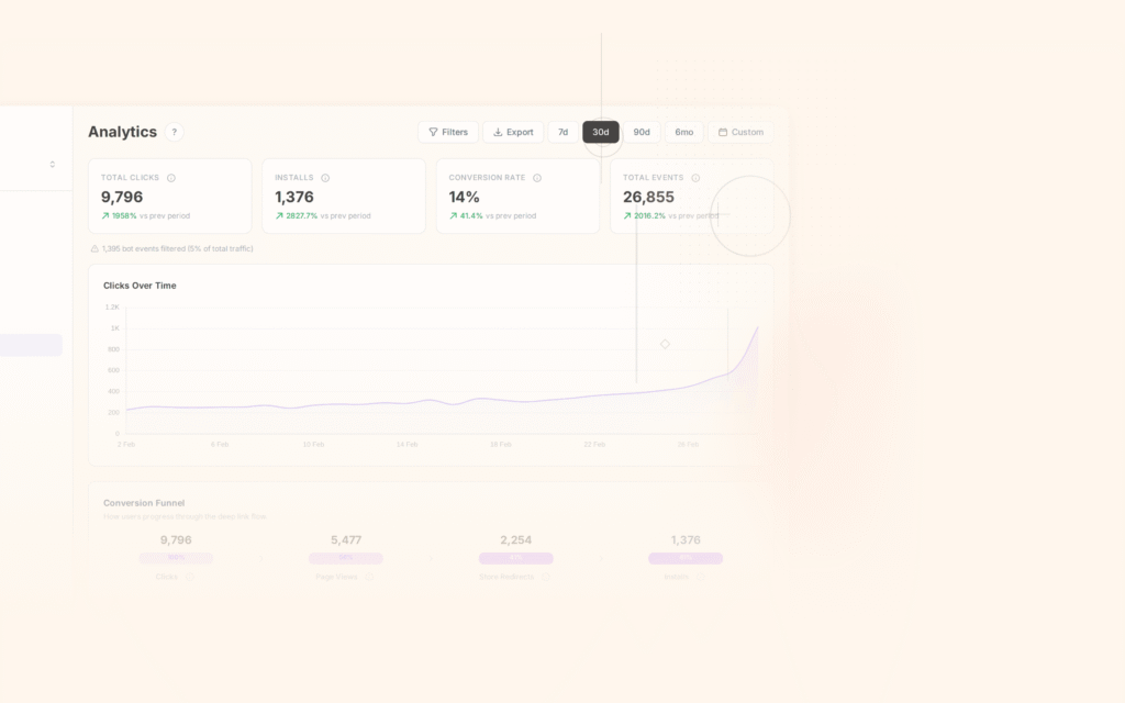
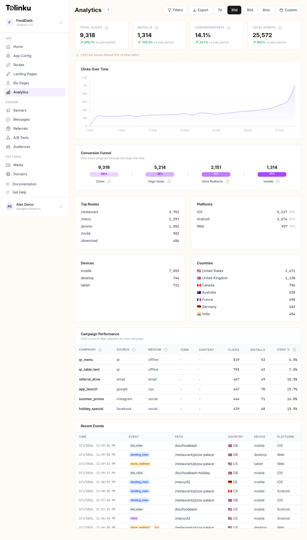 The analytics dashboard with date range selector, filters, charts, and breakdowns.
Types of Deep Link Heatmaps
Geographic Heatmap
A geographic heatmap (choropleth) colors countries, states, or cities by click volume or conversion rate:
| Region | Clicks | Conversion Rate | Color Intensity |
|---|---|---|---|
| California | 8,200 | 14.5% | Dark (high) |
| Texas | 4,100 | 12.8% | Medium |
| New York | 5,500 | 13.2% | Medium-dark |
| Florida | 3,800 | 11.5% | Medium |
| Iowa | 200 | 8.0% | Light (low) |
Geographic heatmaps expose regional patterns that a national average obscures. If your overall conversion rate is 12%, but California is at 14.5% and Iowa is at 8%, you can investigate why and optimize accordingly.
Time-Based Heatmap
A time-based heatmap shows click activity by hour and day of week:
Hour/Day    Mon   Tue   Wed   Thu   Fri   Sat   Sun
──────────────────────────────────────────────────
06:00       ░░    ░░    ░░    ░░    ░░    ░     ░
07:00       ▒▒    ▒▒    ▒▒    ▒▒    ▒▒    ░     ░
08:00       ▓▓    ▓▓    ▓▓    ▓▓    ▓▓    ░░    ░
09:00       ██    ██    ██    ██    ▓▓    ░░    ░
10:00       ▓▓    ▓▓    ▓▓    ▓▓    ▓▓    ▒▒    ░░
11:00       ▓▓    ▓▓    ▓▓    ▓▓    ▓▓    ▒▒    ▒▒
12:00       ██    ██    ██    ██    ██    ▒▒    ▒▒
13:00       ▓▓    ▓▓    ▓▓    ▓▓    ▓▓    ▒▒    ▒▒
...
18:00       ██    ██    ██    ██    ▓▓    ▓▓    ▓▓
19:00       ▓▓    ▓▓    ▓▓    ▓▓    ▒▒    ▓▓    ▓▓

█ = High activity   ▓ = Medium   ▒ = Low   ░ = Very low
This pattern is common for B2C apps: weekday commute hours (8-9am, 6-7pm) and lunch (12pm) peak. Weekends shift later.
Route Heatmap
Show which deep link routes receive the most traffic:
SELECT
  route,
  source,
  COUNT(*) AS clicks,
  ROUND(SUM(CASE WHEN outcome = 'app_opened' THEN 1 ELSE 0 END)::DECIMAL / COUNT(*) * 100, 1) AS open_rate
FROM deep_link_clicks
WHERE timestamp >= NOW() - INTERVAL '7 days'
GROUP BY route, source
ORDER BY clicks DESC;
| Route | Push | Social | QR | Total | |
|---|---|---|---|---|---|
/offers/summer |
5,200 | 3,800 | 1,200 | 800 | 11,000 |
/products/:id |
3,100 | 1,500 | 2,400 | 200 | 7,200 |
/referral |
800 | 0 | 3,500 | 0 | 4,300 |
/dashboard |
1,200 | 2,100 | 0 | 0 | 3,300 |
/settings |
400 | 800 | 0 | 0 | 1,200 |
Color each cell by intensity. This reveals which routes are driven by which channels, and which combinations are underutilized.
Building Heatmaps
Data Preparation
Transform raw click data into a matrix for heatmap rendering:
interface HeatmapCell {
  row: string;    // e.g., hour of day
  column: string; // e.g., day of week
  value: number;  // e.g., click count
}

function buildTimeHeatmap(clicks: ClickData[]): HeatmapCell[] {
  const matrix: Record<string, Record<string, number>> = {};

  for (const click of clicks) {
    const date = new Date(click.timestamp);
    const hour = date.getUTCHours().toString().padStart(2, '0') + ':00';
    const day = ['Sun', 'Mon', 'Tue', 'Wed', 'Thu', 'Fri', 'Sat'][date.getUTCDay()];

    if (!matrix[hour]) matrix[hour] = {};
    matrix[hour][day] = (matrix[hour][day] || 0) + 1;
  }

  const cells: HeatmapCell[] = [];
  for (const [hour, days] of Object.entries(matrix)) {
    for (const [day, count] of Object.entries(days)) {
      cells.push({ row: hour, column: day, value: count });
    }
  }

  return cells;
}
Color Scales
Choose a color scale that communicates intensity:
| Scale | Best For | Example |
|---|---|---|
| Sequential (white to blue) | Single metric (click count) | More clicks = darker blue |
| Diverging (red to blue) | Deviation from average | Below average = red, above = blue |
| Categorical | Outcome type (app open, fallback, error) | Green = open, yellow = fallback, red = error |
function getSequentialColor(value: number, max: number): string {
  const intensity = Math.min(value / max, 1);
  const r = Math.round(255 - (intensity * 200));
  const g = Math.round(255 - (intensity * 150));
  const b = 255;
  return `rgb(${r}, ${g}, ${b})`;
}

function getDivergingColor(value: number, average: number, max: number): string {
  const deviation = (value - average) / max;
  if (deviation > 0) {
    // Above average: blue
    return `rgb(${Math.round(255 - deviation * 200)}, ${Math.round(255 - deviation * 150)}, 255)`;
  } else {
    // Below average: red
    return `rgb(255, ${Math.round(255 + deviation * 200)}, ${Math.round(255 + deviation * 200)})`;
  }
}
Rendering with D3.js
import * as d3 from 'd3';

function renderHeatmap(
  container: HTMLElement,
  data: HeatmapCell[],
  config: { width: number; height: number; cellSize: number }
) {
  const svg = d3.select(container)
    .append('svg')
    .attr('width', config.width)
    .attr('height', config.height);

  const colorScale = d3.scaleSequential(d3.interpolateBlues)
    .domain([0, d3.max(data, d => d.value) || 1]);

  const rows = [...new Set(data.map(d => d.row))].sort();
  const cols = [...new Set(data.map(d => d.column))];

  svg.selectAll('rect')
    .data(data)
    .join('rect')
    .attr('x', d => cols.indexOf(d.column) * config.cellSize)
    .attr('y', d => rows.indexOf(d.row) * config.cellSize)
    .attr('width', config.cellSize - 1)
    .attr('height', config.cellSize - 1)
    .attr('fill', d => colorScale(d.value))
    .append('title')
    .text(d => `${d.row} ${d.column}: ${d.value} clicks`);
}
Use Cases
Optimizing Send Times
Use time heatmaps to find the best hours for push notifications and emails:
SELECT
  EXTRACT(HOUR FROM timestamp) AS hour,
  EXTRACT(DOW FROM timestamp) AS day_of_week,
  COUNT(*) AS clicks,
  ROUND(SUM(CASE WHEN converted THEN 1 ELSE 0 END)::DECIMAL / COUNT(*) * 100, 1) AS conv_rate
FROM deep_link_clicks
WHERE source = 'push'
  AND timestamp >= NOW() - INTERVAL '30 days'
GROUP BY hour, day_of_week
ORDER BY conv_rate DESC;
If Tuesday at 9am has a 15% conversion rate but Friday at 3pm has 6%, schedule your high-value campaigns for Tuesday morning.
Identifying Regional Issues
If your geographic heatmap shows high clicks but low conversions in a specific region, investigate:
- App store availability: Is the app available in that country's store?
- Language: Is the deep link landing content in the user's language?
- Platform distribution: Does the region skew heavily Android, where you might have App Links issues?
- Network speed: Slow connections may cause timeouts before the deep link resolves.
Detecting Fraud
Click fraud often shows up as anomalous patterns in heatmaps:
| Pattern | What It Might Indicate |
|---|---|
| Single country with 10x normal click volume | Click farm |
| Clicks concentrated in a 1-hour window | Bot attack |
| High clicks but 0% conversion from one source | Fraudulent traffic |
| Uniform distribution across all hours (no peaks/valleys) | Automated clicking (bots do not sleep) |
Tolinku for Heatmap Data
Tolinku's analytics provide the click data needed for heatmap visualizations: timestamps, geographic data, routes, and sources. Export this data from the Tolinku dashboard or query it via the analytics API for custom heatmap rendering.
For geographic analytics, see geographic analytics for deep link campaigns. For analytics fundamentals, see deep link analytics: measuring what matters.
Get deep linking tips in your inbox
One email per week. No spam.