Every mobile website has a problem hiding in its traffic reports: a large portion of visitors would get a meaningfully better experience in your app, but they never make it there. They browse your product pages, add items to a cart, or read a few articles, then leave. Some come back on web again. Very few ever open the App Store.
Smart banners exist to close that gap. They sit at the intersection of your web traffic and your app install base, nudging the right people at the right moment to switch over. Done well, they are one of the highest-ROI tools available for mobile growth. Done poorly, they annoy users, hurt your SEO, and get dismissed without a second glance.
This guide covers how to build a web-to-app conversion strategy around smart banners: where to place them, when to show them, what to say, and how to know if any of it is working.
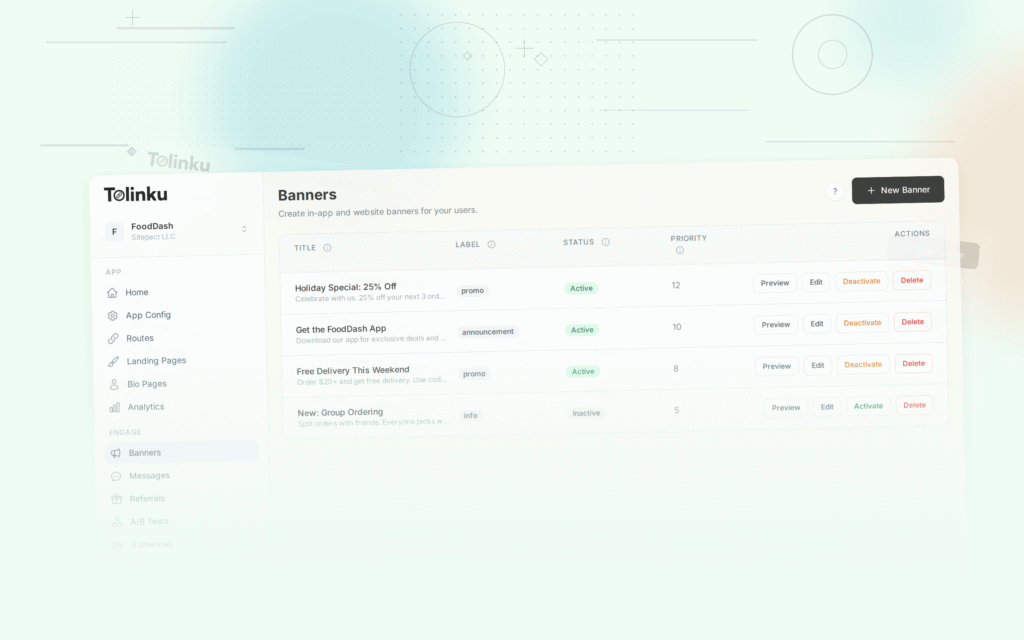
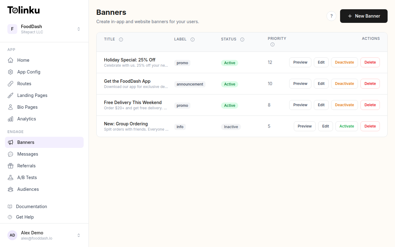 The banners list page showing all configured smart banners with status toggles.
Understanding the Web-to-App Funnel
Before thinking about banner design, it helps to map out the full journey a web visitor takes to become an app user.
Stage 1: Discovery. The user lands on your mobile site, usually from search, social, or a direct link. They have no particular intention to install your app.
Stage 2: Engagement. The user does something on your site: reads content, views a product, logs in, or starts a checkout. At this point, you know more about them than you did when they arrived.
Stage 3: Banner impression. The user sees your smart banner. The timing and placement here determine whether it feels helpful or intrusive.
Stage 4: App store redirect. The user taps the banner and goes to the App Store or Google Play. This is the first hard drop-off point: some percentage will not install.
Stage 5: Install and open. The user installs the app and opens it.
Stage 6: Deep link resolution. If you are using deferred deep linking, the user lands in the exact context they were in on the web, rather than a generic home screen. This is the moment that either justifies the switch or undermines it.
Each stage has its own conversion rate. Improving web-to-app conversion is not just about the banner: it is about reducing friction at every step. But the banner is where the funnel starts, which makes it worth getting right.
Placement Strategies
Where you show a banner matters as much as what the banner says. Different page types attract different users with different intent levels, and your placement strategy should reflect that.
Above-the-fold banners
The most common placement is a slim bar at the top of the screen, just below the browser chrome or status bar. This is what Apple's own Smart App Banners use, and it has become a familiar pattern for mobile users.
The advantage is visibility: almost every visitor will see it. The disadvantage is that users with low intent will dismiss it immediately. If your goal is volume (getting as many app installs as possible from all traffic), top placement makes sense. If your goal is quality (getting users who are genuinely engaged), you may want to wait.
Bottom sheet banners
A banner anchored to the bottom of the screen is less disruptive to reading or browsing. Users do not have to scroll past it to reach content. This format tends to perform better on content-heavy pages where reading is the primary activity.
The Google Intrusive Interstitials policy specifically calls out banners that cover a "reasonable amount" of content. A bottom-anchored banner that stays slim (typically under 90px) is generally safe territory. More on this in the SEO implications section.
In-content banners
For long-form content, placing a banner mid-article (after two or three scroll interactions) captures readers who are genuinely engaged. Someone who has scrolled halfway through a 1,500-word piece is not a casual visitor. Showing them an app prompt at that point is contextually appropriate.
Post-action banners
Trigger the banner after a meaningful action: a successful purchase, a completed onboarding step, a saved item, or a login. At this point, the user has demonstrated value and is more likely to want to continue the relationship in the app. Post-action banners consistently outperform impression-based placements because the user has a concrete reason to care.
Timing Triggers
Timing is where most smart banner implementations fall apart. Showing a banner to every visitor on every page visit produces high dismissal rates and trains users to ignore your prompts.
Consider these trigger conditions:
Time on page. Wait until the user has spent at least 15-20 seconds on a page before showing the banner. This filters out users who bounced immediately and would have dismissed it regardless.
Scroll depth. Trigger after the user has scrolled 40-50% of the page. Scroll depth is a reliable proxy for engagement.
Return visits. A user on their second or third visit to your site is more valuable than a first-time visitor. They already understand what you offer. Showing a banner to return visitors (while suppressing it for first-time visitors) focuses your conversion effort on higher-intent users.
Exit intent. On mobile, exit intent is harder to detect than on desktop, but scroll-up velocity (rapid upward scrolling) is a reasonable proxy. Showing a banner as the user is about to leave is a low-friction moment because they are done with the current page anyway.
Session-based caps. Limit how many times a user sees your banner within a session or across sessions. Showing it more than once per session rarely improves conversion and consistently increases annoyance. Most analytics show that after the first or second impression, conversion rates drop to near zero while dismissal rates climb.
Contextual Messaging
The default Apple Smart App Banner says something like "View in App." That works adequately for some apps, but it misses an opportunity.
The most effective banners tell users what they will get, not just where they will go.
Compare these two prompts on a recipe app:
- Generic: "Download [App Name] – Free on the App Store"
- Contextual: "Save this recipe and access it offline in the app"
The second version answers an implicit question the user might have: "Why should I bother installing the app right now?" It ties the action to something the user is already doing on the current page.
Contextual messaging requires knowing something about the current page or user. Your banner system needs to be able to read the page context, whether that is the product category, the content type, the user's login state, or the referral source.
For e-commerce sites, a product page might show: "See size availability and checkout faster in the app." For a media site, a long article might show: "Read offline and pick up where you left off." For a food delivery app, a restaurant page might show: "Order from this restaurant in the app."
The Tolinku smart banners feature supports custom message fields that can be populated dynamically based on page metadata, making it straightforward to implement this kind of contextual messaging without a custom build.
Deferred Deep Linking: The Conversion Multiplier
Even a perfectly timed, contextually relevant banner will underperform if the user taps it, installs the app, and lands on a generic home screen with no connection to what they were looking at.
Deferred deep linking solves this. When a user taps the banner, the platform records the context: the URL they were viewing, any UTM parameters, the referral source. After they install and open the app, that context is delivered and the app opens directly to the relevant content.
For an e-commerce app, this means the user lands on the same product page they were viewing on the web. For a content app, they land on the same article. This continuation of context dramatically improves post-install engagement because the user's intent is preserved through the install process.
According to research published in Mobile Marketer, deferred deep linking can increase post-install engagement rates significantly compared to generic app open flows. The key insight is that the value of an app install is not the install itself: it is what the user does next.
You can read more about setting up deferred deep linking in the Tolinku deep linking docs.
Measuring Success
Web-to-app conversion is a multi-step process, so measuring it requires tracking more than just banner clicks.
Impression rate. What percentage of eligible visitors (those who meet your trigger conditions) see the banner? If this is low, check whether your trigger conditions are too restrictive or whether there are JavaScript errors preventing the banner from loading.
Click-through rate (CTR). What percentage of users who see the banner tap it? A well-designed, contextually relevant banner on a high-intent page should achieve 3-8% CTR. Generic banners on low-intent pages may see 1% or less.
App store conversion rate. Of users who click through to the App Store or Google Play, what percentage install the app? This is partly outside your control (it depends on your app store listing, reviews, and screenshots), but it is worth tracking to identify drop-off.
Post-install retention. Are users who came through web banners sticking around after install? Users who installed because of deferred deep linking (landing in relevant context) typically show higher Day 1 and Day 7 retention than users who arrived via generic installs.
Assisted conversion. Some users will tap the banner, not install immediately, but return later. Attribution windows (typically 7-30 days) can credit these delayed installs back to the banner campaign.
The Tolinku analytics dashboard tracks the full funnel from banner impression through install, giving you per-banner and per-page breakdowns without requiring additional instrumentation.
Common Mistakes
Showing banners on every page visit. Users who dismiss your banner on visit one will dismiss it on visit two. Respecting dismissals and capping impressions per user session is basic hygiene.
Ignoring users who already have the app. If a user has your app installed, showing them an "install the app" banner is both redundant and potentially confusing. Smart banner systems can detect whether the app is installed (with some platform limitations) and show an "open in app" prompt instead, which carries a much higher conversion rate.
No mobile-specific copy. Banner copy written for desktop contexts often sounds generic or off-tone on mobile. Write specifically for someone who is already on their phone and is being asked to take one more step.
Skipping A/B testing. Small changes in banner copy, color, or placement can produce large differences in CTR. Running A/B tests on banner variants is worth the setup time. The Tolinku display behavior docs cover how to configure display conditions that work well with A/B testing setups.
Start with placement and timing, get your baseline conversion rate, then layer in contextual messaging and deferred deep linking to improve quality. Measure the full funnel, not just banner clicks, and iterate from there.
Further reading: Smart App Banners: Beyond Apple's Default and the Tolinku smart banners setup guide.
Get deep linking tips in your inbox
One email per week. No spam.