Every growth team talks about A/B testing. Fewer actually run disciplined experiments on their deep links, and fewer still share what they learned. The result is that most teams are guessing where to send users, what banners to show, and how to structure their onboarding flows.
The following six scenarios illustrate what A/B testing looks like in practice across different verticals. Each one walks through a realistic problem, a hypothesis, a test setup, plausible results based on industry benchmarks, and a takeaway you can apply to your own campaigns. The companies are fictional, but the patterns and numbers are grounded in published conversion rate benchmarks and common growth team practices. If you're new to deep link testing, start with our guide on A/B testing deep links and landing pages for the foundational concepts.
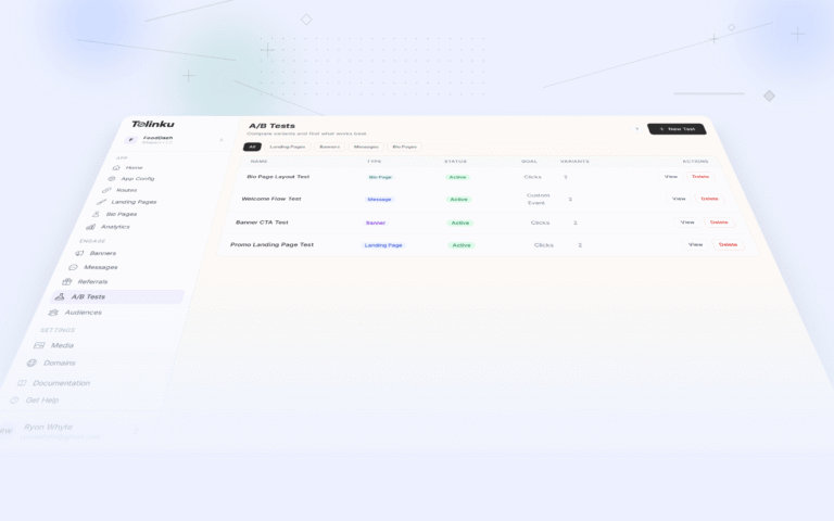
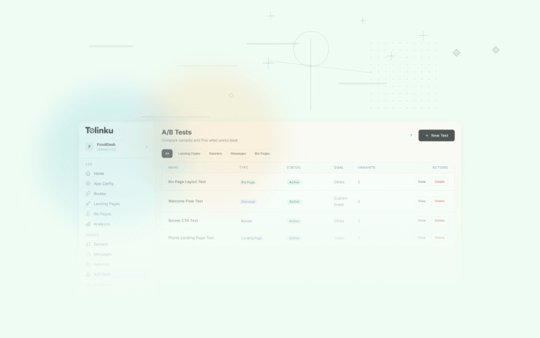
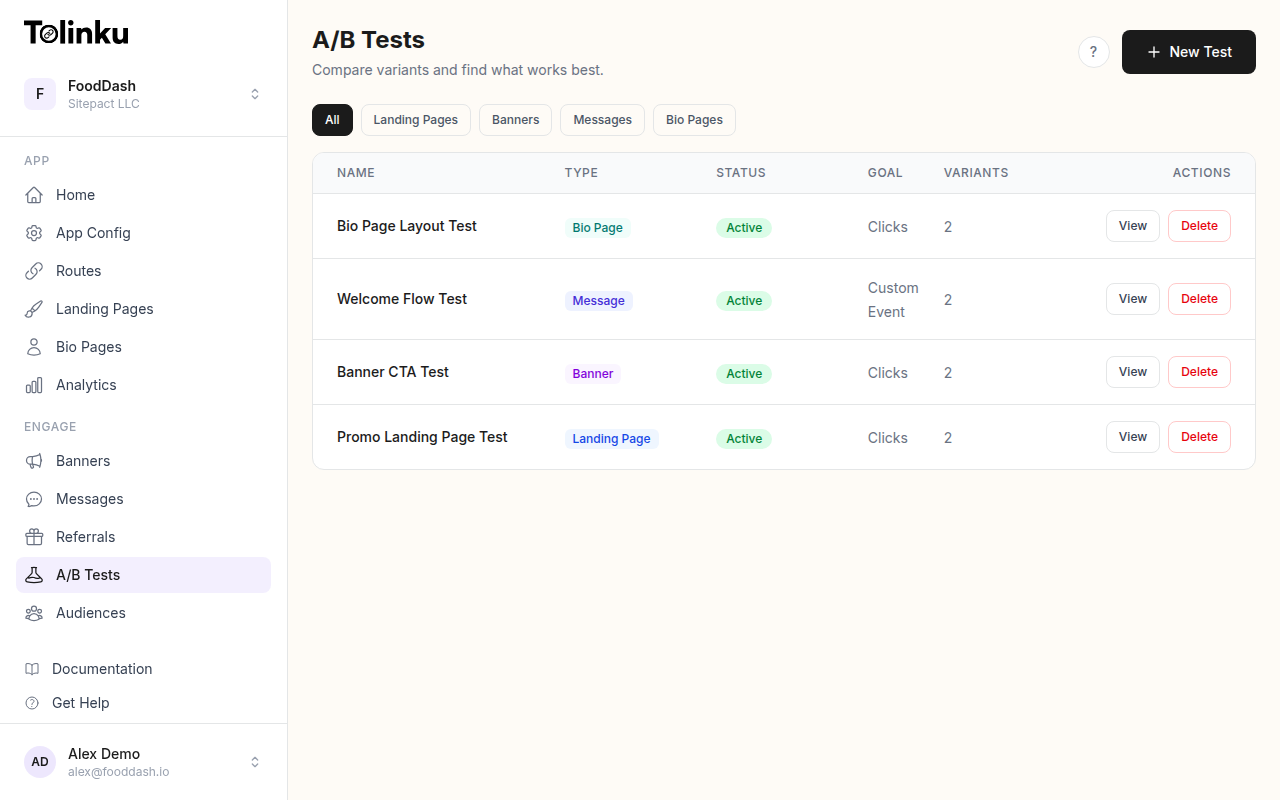 The A/B tests list page showing test names, status, types, and variant counts.
Scenario 1: Smart Banner Optimization at CartLoop (E-commerce)
The problem. CartLoop, an online fashion retailer, had a mobile web experience generating 2.1 million monthly visits. Their smart banner promoting the native app had a tap rate of 1.8%, which translated to roughly 37,800 taps per month. The growth team suspected the banner wasn't compelling enough, but they didn't know which element to change first.
The hypothesis. Changing the banner's CTA from generic text ("Open in App") to a benefit-driven message ("Shop 20% Faster in the App") would increase tap rates by at least 15%.
Test setup. The team configured an A/B test targeting their smart banner with three variants, splitting traffic evenly:
{
  "test_name": "banner_cta_optimization_q1",
  "type": "banner",
  "goal": "tap_rate",
  "variants": [
    {
      "name": "control",
      "weight": 0.34,
      "banner": {
        "title": "CartLoop",
        "body": "Free shipping on all orders",
        "cta": "Open in App"
      }
    },
    {
      "name": "benefit_speed",
      "weight": 0.33,
      "banner": {
        "title": "CartLoop",
        "body": "Browse collections 20% faster",
        "cta": "Switch to App"
      }
    },
    {
      "name": "benefit_exclusive",
      "weight": 0.33,
      "banner": {
        "title": "CartLoop",
        "body": "App-only styles just dropped",
        "cta": "See Exclusives"
      }
    }
  ]
}
The test ran for 21 days, collecting over 140,000 impressions per variant.
Results.
| Variant | Impressions | Taps | Tap Rate | Lift vs. Control |
|---|---|---|---|---|
| Control ("Open in App") | 142,300 | 2,561 | 1.80% | — |
| Speed benefit | 141,800 | 3,119 | 2.20% | +22.2% |
| Exclusivity benefit | 140,500 | 3,866 | 2.75% | +52.8% |
The exclusivity variant dramatically outperformed the other two. More importantly, the downstream conversion rate (tap to purchase within 24 hours) was also higher for the exclusivity variant at 4.1%, compared to 3.3% for the control.
Key takeaway. Benefit-driven CTAs outperform generic action labels, but the type of benefit matters. Exclusivity ("app-only") outperformed speed ("20% faster") by a wide margin. For e-commerce apps, scarcity and exclusivity are stronger motivators than utility claims. Learn more about optimizing these touchpoints in our conversion rate optimization for deep links guide.
Scenario 2: Landing Page Redesign at VaultPay (Fintech)
The problem. VaultPay, a personal finance app, ran paid campaigns on social media that drove users to a landing page when the app wasn't installed. The existing page was a standard "Download our app" layout with a hero image, three feature bullets, and app store badges. The page had a 12% click-through rate to the App Store, but only 6% of those visitors actually completed the install. The team wanted to improve the full funnel from landing page visit to first account creation.
The hypothesis. A social proof-heavy landing page (showing real user reviews, download counts, and security certifications) would increase install completion by at least 25% compared to the feature-focused layout.
Test setup. They created two landing page variants and split traffic 50/50 on their campaign deep links:
- Control: Hero image, three feature bullets ("Track spending," "Set budgets," "Investment insights"), two app store badges
- Variant B: User testimonial carousel (three rotating quotes), "2M+ downloads" badge, bank-level encryption seal, single prominent CTA button
The test ran for 28 days across 48,000 landing page visits.
Results.
| Metric | Control (Features) | Variant B (Social Proof) | Lift |
|---|---|---|---|
| App Store CTR | 12.0% | 16.8% | +40.0% |
| Install completion | 6.0% | 9.2% | +53.3% |
| Account created (within 48h) | 2.1% | 3.8% | +81.0% |
The social proof page didn't just get more clicks to the store; it attracted higher-intent users who were more likely to complete the install and sign up.
Key takeaway. For fintech apps where trust is a barrier, social proof significantly outperforms feature lists. The compounding effect is notable: a 40% improvement in CTR combined with higher install and signup rates yielded an 81% increase in end-to-end conversions. Trust signals reduce friction at every step of the funnel.
Scenario 3: Deep Link Destination Testing at Cliqfeed (Social/Content)
The problem. Cliqfeed, a short-form video platform, shared content links across social media, email newsletters, and creator profiles. When a user with the app installed tapped a shared video link, it opened the video's detail page. But Cliqfeed noticed a problem: 62% of users watched the linked video and then left the app within 30 seconds. The session depth (videos watched per session) was 1.3 for deep-linked users versus 4.7 for organic opens.
The hypothesis. Opening the video within the "For You" feed (positioned at the top) rather than as an isolated detail page would increase session depth and watch time.
Test setup. The team configured two deep link destinations for the same shared content:
{
  "test_name": "video_destination_feed_vs_detail",
  "type": "route",
  "goal": "session_depth",
  "route": "/video/:id",
  "variants": [
    {
      "name": "detail_page",
      "weight": 0.5,
      "destination": {
        "screen": "video_detail",
        "params": { "video_id": ":id" }
      }
    },
    {
      "name": "feed_context",
      "weight": 0.5,
      "destination": {
        "screen": "for_you_feed",
        "params": {
          "initial_video": ":id",
          "feed_type": "related"
        }
      }
    }
  ]
}
They ran the test for 14 days with 320,000 deep link opens.
Results.
| Metric | Detail Page | Feed Context | Lift |
|---|---|---|---|
| Avg. session depth | 1.3 videos | 3.1 videos | +138.5% |
| Avg. watch time | 22 seconds | 87 seconds | +295.5% |
| 7-day retention | 8.2% | 14.6% | +78.0% |
| Shares from session | 0.04 per user | 0.18 per user | +350.0% |
Placing the shared video inside a scrollable feed created a dramatically more engaging experience. Users who arrived in the feed discovered adjacent content and stayed longer. The retention improvement alone justified the change.
Key takeaway. Where you send users matters more than most teams realize. A detail page answers the immediate question ("show me this video") but creates a dead end. Embedding the linked content within a browsable context encourages discovery. For content platforms, always test isolated views versus feed-embedded views.
Scenario 4: CTA Testing at Nexboard (SaaS)
The problem. Nexboard, a project management tool, used deep links in their email campaigns to drive mobile users into the app. Each email included a CTA button linking to the relevant project or task. The click-to-open rate on these emails was 18%, but only 31% of those clicks resulted in the user completing an action in the app (commenting, updating a status, or assigning a task). The team wanted to improve the action completion rate.
The hypothesis. Personalizing the CTA to reference the specific action needed (e.g., "Review Sarah's design mockup") instead of using a generic label ("View in App") would increase action completion by 20%.
Test setup. Rather than testing the deep link destination (which was always the relevant task screen), they tested the email CTA text and the corresponding landing page headline for users without the app:
- Control: CTA says "View in App," landing page says "Open Nexboard to continue"
- Variant B: CTA says "[Task name]: [Action needed]," landing page says "Sarah is waiting for your review"
The test ran for 18 days across 52,000 email recipients.
Results.
| Metric | Control (Generic) | Variant B (Personalized) | Lift |
|---|---|---|---|
| Email CTR | 18.0% | 23.4% | +30.0% |
| Action completion | 31.0% | 47.2% | +52.3% |
| Time to action | 4.2 minutes | 1.8 minutes | -57.1% |
Personalized CTAs not only got more clicks; they primed users for the action they needed to take. Users arrived knowing exactly what was expected and completed the action faster.
Key takeaway. Context-rich CTAs create a mental model before the user even opens the app. When someone reads "Review Sarah's design mockup," they've already committed to the action before tapping. For SaaS tools where the goal is a specific action (not just an app open), always personalize the CTA to match the task.
Scenario 5: Onboarding Flow Testing at DungeonRift (Gaming)
The problem. DungeonRift, a mobile RPG, used paid campaigns with deferred deep links to acquire new players. The deferred link preserved the campaign context (e.g., a specific character class promotion) through the install flow. After install, new users entered a standard onboarding tutorial that took 4.5 minutes to complete. The tutorial completion rate was 41%, meaning 59% of paid installs never reached the core game loop.
The hypothesis. Skipping the standard tutorial and dropping deferred-deep-linked users directly into a pre-built character (matching the promoted class) with a condensed 60-second "quick start" overlay would increase tutorial completion and day-1 retention.
Test setup. The team split their deferred deep link traffic:
{
  "test_name": "onboarding_abbreviated_vs_full",
  "type": "route",
  "goal": "tutorial_completion",
  "route": "/promo/:class",
  "variants": [
    {
      "name": "full_tutorial",
      "weight": 0.5,
      "destination": {
        "screen": "tutorial_start",
        "params": { "source": "campaign" }
      }
    },
    {
      "name": "quick_start",
      "weight": 0.5,
      "destination": {
        "screen": "quick_start",
        "params": {
          "preset_class": ":class",
          "skip_tutorial": true
        }
      }
    }
  ]
}
They ran the test for 21 days with 28,000 new installs from paid campaigns.
Results.
| Metric | Full Tutorial | Quick Start | Lift |
|---|---|---|---|
| Tutorial/onboarding completion | 41.0% | 72.3% | +76.3% |
| Reached core game loop | 38.5% | 69.1% | +79.5% |
| Day-1 retention | 22.0% | 34.8% | +58.2% |
| Day-7 retention | 8.1% | 13.4% | +65.4% |
| Avg. revenue per install (Day 30) | $0.42 | $0.71 | +69.0% |
The quick start variant wasn't just faster; it was dramatically more effective at every stage. Users who chose their class in the ad creative were already primed for that character, and the condensed onboarding kept their momentum.
Key takeaway. When users arrive through a campaign promoting a specific feature or offer, honor that context immediately. A generic onboarding flow ignores the intent signal that brought them in. For gaming and subscription apps, test abbreviated onboarding for campaign-sourced users who have already self-selected their interest.
Scenario 6: Referral Incentive Testing at FreshDrop (E-commerce)
The problem. FreshDrop, a grocery delivery app, had a referral program offering "$10 off for you and your friend." The referral link used deferred deep linking to credit the referrer after the friend installed and placed their first order. The program generated 3,200 referral link shares per month, but only 8.4% of those resulted in a completed referral (friend installs, creates account, and places first order).
The hypothesis. Testing double-sided incentives with different reward structures would reveal whether the barrier was the referrer's motivation to share or the friend's motivation to convert.
Test setup. The team configured three referral incentive variants:
- Control: $10 off for both referrer and friend
- Variant B: $5 off for referrer, $15 off for friend (friend-weighted)
- Variant C: Free delivery for a month for the referrer, $10 off for friend (experiential reward)
Each variant used a different referral link route with distinct tracking parameters. The test ran for 30 days.
Results.
| Metric | Control ($10/$10) | Variant B ($5/$15) | Variant C (Free delivery/$10) |
|---|---|---|---|
| Shares per user | 1.4 | 1.1 | 2.3 |
| Friend install rate | 14.2% | 18.7% | 13.8% |
| First order rate | 8.4% | 12.1% | 8.0% |
| Referrer repeat shares | 22% | 18% | 41% |
| Total completed referrals | 268 | 292 | 384 |
The results were surprising. Variant C generated the most total completed referrals despite having the lowest per-share conversion rate. The experiential reward (free delivery for a month) motivated referrers to share far more frequently: 2.3 shares per user compared to 1.4 for the control. The volume of shares more than compensated for the slightly lower conversion rate.
Key takeaway. Referral program optimization isn't just about conversion rate; it's about total completed referrals. An incentive that motivates more sharing can outperform one with a higher per-share conversion rate. Test both the referrer's and the friend's incentives independently, and measure the full funnel from share to completed referral. Experiential rewards (ongoing benefits) can be stronger motivators than one-time discounts.
Patterns Across All Six Scenarios
Looking across these scenarios, several themes emerge:
Context preservation wins. The biggest gains came from tests that respected the user's intent and context: exclusivity messaging for shoppers, social proof for finance, feed context for content, personalized CTAs for tasks, campaign-matched onboarding for gamers, and ongoing rewards for referrers.
Compound effects matter. Small improvements at each funnel stage multiply. The fintech landing page scenario showed how a 40% improvement in click-through became an 81% improvement in account creation because higher-intent users converted better at every subsequent step.
Volume can beat conversion rate. The grocery delivery referral scenario's best-converting incentive wasn't the overall winner. The incentive that drove the most sharing volume generated more total referrals. Always measure the metric that matters most to the business, not just the most obvious conversion rate.
Test one variable at a time (usually). The e-commerce banner scenario tested CTA copy while holding everything else constant. This made the results clearly attributable. When you test multiple variables simultaneously, you learn less from the outcome.
Run tests long enough. These tests ran 14 to 30 days. Short tests are prone to novelty effects and day-of-week variance. The Google Experiments documentation recommends at least two full business cycles for reliable results.
Ready to start running your own experiments? Tolinku's A/B testing features let you set up variant routing, banner tests, and landing page experiments from your dashboard, with built-in analytics to measure what's working.
Get deep linking tips in your inbox
One email per week. No spam.