Every day, millions of mobile users browse websites on their phones and never discover that the site they are visiting has a native app. Smart app banners solve this problem. They are small, unobtrusive prompts at the top or bottom of a webpage that invite users to open or install the associated app.
Apple introduced native smart app banners in iOS 6 with a simple meta tag. It was a good first step. But that was 2012. The mobile landscape has changed enormously since then. If you are still relying solely on Apple's default banner, you are leaving conversions, Android users, and valuable data on the table.
This guide covers how Apple's default smart app banners work, why they fall short, and how to build (or deploy) custom smart banners that actually perform.
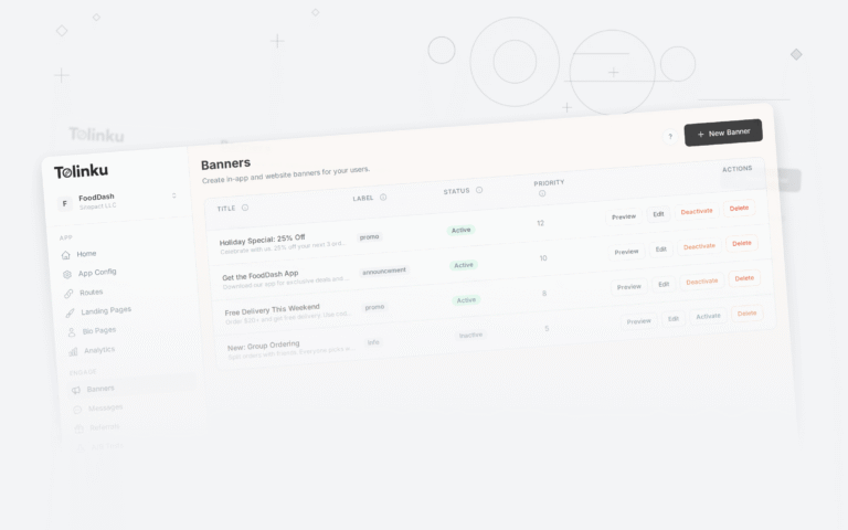
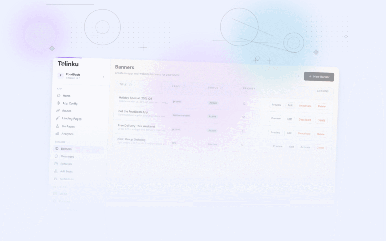
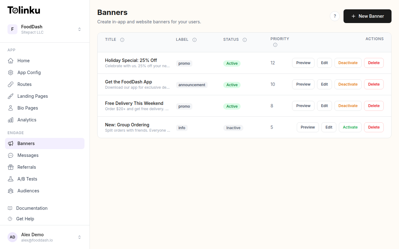 The banners list page showing all configured smart banners with status toggles.
Apple's Default Smart App Banner
Apple's built-in smart app banner is triggered by a single meta tag in your HTML <head>:
<meta name="apple-itunes-app" content="app-id=123456789">
When Safari on iOS encounters this tag, it renders a native banner at the top of the page. The banner shows your app's icon, name, rating, and price. If the user already has the app installed, the banner says "OPEN" instead of "VIEW."
You can also pass context through to your app using the app-argument parameter:
<meta name="apple-itunes-app" content="app-id=123456789, app-argument=https://example.com/product/42">
This tells your app which content the user was viewing on the web, so you can deep link them to the right screen after they tap the banner.
For a basic use case, the native banner works. Apple manages the rendering, the styling, and the interaction. You add one line of HTML and you are done. Apple's Safari Web Content Guide documents the full specification.
But "basic" is exactly the problem.
Why the Default Falls Short
The native smart app banner has several hard limitations that make it insufficient for any serious web-to-app conversion strategy.
No Android support. Apple's meta tag only works in Safari on iOS. It does nothing on Chrome, Firefox, Samsung Internet, or any other browser. Given that Android holds roughly 72% of global mobile market share, ignoring Android users is a major gap.
No customization. You cannot change the banner's colors, text, call-to-action button, or position. It always looks the same: a grey bar at the top of the viewport. Your brand identity is absent.
No analytics. Apple gives you zero data. You do not know how many users saw the banner, how many tapped it, or how many installed your app afterward. Without measurement, there is no way to optimize.
No targeting. The banner appears for every iOS Safari user on every page where the meta tag exists. You cannot show it only to new visitors, only on specific pages, only in certain countries, or only during a promotional period.
No A/B testing. You get one banner design. One CTA. One set of rules. There is no way to test whether "Open in App" converts better than "Get the App" or whether a bottom banner outperforms a top banner.
Dismissal is permanent (per session). When a user taps the "X" to close the banner, it stays dismissed for that session. You have no control over whether it comes back the next day, the next week, or never.
These limitations are not minor annoyances. They represent real lost revenue for any business trying to move web traffic into their native app.
Building Custom Smart Banners
If you need smart app banners that work across platforms, match your brand, and provide real data, you need to build them yourself or use a platform that handles it for you. Our guide on custom smart banners walks through the full range of options.
Here is what a basic custom smart banner looks like in HTML and CSS:
<div id="app-banner" class="app-banner" role="banner">
<button class="app-banner-close" aria-label="Close banner">×</button>
<img src="/images/app-icon.png" alt="MyApp icon" class="app-banner-icon" />
<div class="app-banner-text">
<strong>MyApp</strong>
<span>A better experience in the app</span>
</div>
<a href="https://your-deep-link.com/open" class="app-banner-cta">Open</a>
</div>
.app-banner {
  display: flex;
  align-items: center;
  gap: 12px;
  padding: 10px 16px;
  background: #ffffff;
  border-bottom: 1px solid #e0e0e0;
  font-family: -apple-system, BlinkMacSystemFont, sans-serif;
  position: fixed;
  top: 0;
  left: 0;
  right: 0;
  z-index: 9999;
}

.app-banner-icon {
  width: 48px;
  height: 48px;
  border-radius: 12px;
}

.app-banner-text {
  flex: 1;
  display: flex;
  flex-direction: column;
  font-size: 14px;
}

.app-banner-cta {
  background: #007aff;
  color: #fff;
  padding: 8px 18px;
  border-radius: 20px;
  text-decoration: none;
  font-weight: 600;
  font-size: 14px;
}

.app-banner-close {
  background: none;
  border: none;
  font-size: 20px;
  cursor: pointer;
  color: #999;
  padding: 0 4px;
}
And the JavaScript to handle dismissal with a cookie so you can control when it reappears:
document.addEventListener('DOMContentLoaded', () => {
  const banner = document.getElementById('app-banner');
  const closeBtn = banner.querySelector('.app-banner-close');

  // Check if the user dismissed the banner recently
  if (document.cookie.includes('app_banner_dismissed=1')) {
    banner.style.display = 'none';
    return;
  }

  closeBtn.addEventListener('click', () => {
    banner.style.display = 'none';
    // Set a cookie that expires in 3 days
    const expires = new Date(Date.now() + 3 * 24 * 60 * 60 * 1000).toUTCString();
    document.cookie = `app_banner_dismissed=1; expires=${expires}; path=/`;
  });
});
This is a starting point. It handles both platforms, it is styled to your brand, and the dismissal behavior is under your control. But a production banner needs much more: device detection, deep linking logic, analytics tracking, and targeting rules. Building all of that from scratch takes significant engineering effort.
Targeting and Personalization
The most effective smart app banners do not show the same message to every visitor. They adapt based on context.
Device Detection
At minimum, your banner should detect the user's operating system and link to the correct app store. The User-Agent string (or the newer User-Agent Client Hints API) tells you what you need:
function getMobilePlatform() {
  const ua = navigator.userAgent;
  if (/iPad|iPhone|iPod/.test(ua)) return 'ios';
  if (/Android/.test(ua)) return 'android';
  return null;
}

const platform = getMobilePlatform();
if (platform === 'ios') {
  ctaLink.href = 'https://apps.apple.com/app/id123456789';
} else if (platform === 'android') {
  ctaLink.href = 'https://play.google.com/store/apps/details?id=com.example.app';
}
For a more future-proof approach, you can use the User-Agent Client Hints API where supported:
if (navigator.userAgentData) {
  navigator.userAgentData.getHighEntropyValues(['platform']).then(ua => {
    if (ua.platform === 'Android') {
      // Show Android banner
    }
  });
}
Geo-Targeting
Not every app is available in every country. If your app only serves the US and UK, showing a banner to visitors in Japan wastes their attention and your credibility. Server-side IP geolocation (using databases like MaxMind GeoLite2) lets you control banner visibility by region.
Page Context
A banner on your homepage might say "Download our app." But a banner on a product page should say "View this item in the app" and deep link directly to that product. Matching the banner message to the page content dramatically increases tap-through rates.
Returning vs. New Visitors
First-time visitors are discovering your brand. They need a different pitch than someone who has visited five times but still has not installed the app. For returning visitors, you might increase urgency: "Your cart is waiting in the app" or "Get exclusive app-only prices."
A/B Testing Your Banners
Without testing, you are guessing. A/B testing lets you find out what actually works for your audience.
Here are the variables worth testing:
CTA text. "Open" vs. "Get the App" vs. "Continue in App" vs. "Try the App." Small wording changes can shift click-through rates by 20% or more.
Banner position. Top banners are the convention (Apple set this pattern), but bottom banners can perform better because they are closer to the user's thumb on mobile. Test both.
Timing. Should the banner appear immediately on page load? After 3 seconds? After the user scrolls 50% of the page? Immediate display can feel aggressive. Delayed display catches engaged users. The right answer depends on your audience.
Design. Minimal text-only banners vs. banners with app screenshots. Dark mode vs. light mode. Branded colors vs. neutral colors.
Incentives. "Open in App" vs. "Open in App for 10% Off." Adding an incentive increases clicks but may attract lower-quality users who only want the discount.
A simple client-side A/B test assigns users to a variant and tracks the results:
function getBannerVariant() {
  const stored = localStorage.getItem('banner_variant');
  if (stored) return stored;

  const variant = Math.random() < 0.5 ? 'A' : 'B';
  localStorage.setItem('banner_variant', variant);
  return variant;
}

const variant = getBannerVariant();

if (variant === 'A') {
  ctaButton.textContent = 'Open in App';
} else {
  ctaButton.textContent = 'Continue in App';
}

// Track impressions
fetch('/api/banner-event', {
  method: 'POST',
  body: JSON.stringify({ event: 'impression', variant }),
  headers: { 'Content-Type': 'application/json' }
});
Running tests manually like this works, but analyzing results requires statistical rigor. You need enough sample size for significance, and you need to track both clicks and downstream conversions (installs, in-app actions) to understand true performance.
Scheduling and Display Rules
Showing a banner on every page load to every visitor is a fast way to annoy people. Smart display rules keep banners effective without becoming intrusive.
Frequency Capping
Limit how often a user sees the banner. Common approaches:
- Show the banner on the first 3 page views, then hide it for 7 days
- Show it once per session
- Show it a maximum of 5 times total before stopping permanently
Time-Based Display
Promotional banners should have start and end dates. If you are running a holiday campaign ("Download the app for free shipping through December 25"), the banner should automatically stop appearing on December 26.
Dismissal Behavior
When a user closes the banner, how long should it stay hidden? Options include:
- Session-based: comes back next visit (Apple's default behavior)
- Time-based: stays hidden for N days, then reappears
- Permanent: once dismissed, never shown again (stored in localStorage or a cookie)
- Escalating: first dismissal hides it for 1 day, second for 7 days, third for 30 days
The escalating approach respects users who keep saying "no" while still giving you a chance to reach users who might be ready later.
Page Rules
Not every page on your site benefits from a banner. Checkout pages, login forms, and support pages often convert poorly for app installs because the user is focused on a task. Show banners on content pages, product listings, and the homepage instead.
Measuring Banner Performance
You cannot improve what you do not measure. Here are the metrics that matter for smart app banners:
Impression rate. How many mobile visitors actually see the banner? If your banner loads lazily or is hidden by display rules, the impression count will be lower than your mobile traffic. That is expected.
Click-through rate (CTR). The percentage of users who see the banner and tap the CTA. Industry averages for well-designed custom banners range from 2% to 8%, depending on the vertical and the offer. Apple's default banner typically converts at the lower end of this range because of its generic appearance.
Install rate. Of the users who clicked, how many actually installed the app? This is harder to track because the journey crosses from your website to the app store to the app itself. Deep linking platforms can connect these dots using deferred deep linking and install attribution. For a complete measurement framework, see banner analytics tracking.
Post-install engagement. Did the user who installed via the banner actually use the app? Did they complete a purchase, sign up, or perform a key action? Tracking this requires your app SDK to report back to your analytics system.
Revenue per banner impression. The ultimate metric. If you can attribute revenue to banner-driven installs, you know exactly what your banner is worth and how much you should invest in optimizing it.
A basic analytics setup tracks impressions and clicks on the client side, then sends them to your backend:
// Track when the banner becomes visible
const observer = new IntersectionObserver((entries) => {
  entries.forEach(entry => {
    if (entry.isIntersecting) {
      fetch('/api/banner-event', {
        method: 'POST',
        body: JSON.stringify({
          event: 'impression',
          bannerId: 'summer-promo',
          page: window.location.pathname,
          platform: getMobilePlatform(),
          timestamp: Date.now()
        }),
        headers: { 'Content-Type': 'application/json' }
      });
      observer.disconnect();
    }
  });
});

observer.observe(document.getElementById('app-banner'));
But tracking installs and post-install events requires a full attribution pipeline. This is where most teams either build something fragile in-house or reach for a platform that handles it.
Smart Banners with Tolinku
Building custom smart banners, A/B tests, targeting rules, scheduling, and analytics from scratch is a significant investment. Tolinku's smart banner feature handles all of this out of the box.
With the Tolinku Web SDK, adding a smart banner to your site takes a few lines of code:
<script src="https://cdn.tolinku.com/sdk/banner.js"
  data-key="tolk_pub_your_key_here"
  async>
</script>
That single script tag loads a banner configured through the Tolinku dashboard. From the dashboard, you can:
- Design banners that match your brand, with custom colors, text, icons, and CTA buttons
- Create multiple banners for different campaigns, pages, or audiences
- Set targeting rules and schedules based on device, geography, page URL patterns, and visitor behavior
- Configure display behavior including frequency capping, dismissal rules, and scroll triggers
Banners work on both iOS and Android. They include built-in deep linking so users go directly to the right content in your app. All impressions, clicks, and conversions are tracked automatically in Tolinku's analytics dashboard, with no extra instrumentation needed.
The result: you spend your time writing banner copy and analyzing results instead of writing banner infrastructure.
Best Practices
Whether you build your own banners or use a platform like Tolinku, these guidelines will help you get better results.
Design Tips
Keep it small. For more on visual and copy strategy, see banner design best practices. Your banner should take up no more than 60-70 pixels of vertical space. Anything larger feels like an interstitial, and Google penalizes intrusive interstitials in search rankings.
Use your app icon. Users recognize icons faster than they read text. A familiar app icon builds trust and tells users exactly which app they are being invited to open.
Match the page style. If your website uses a dark theme, your banner should too. A bright white banner on a dark site looks broken. Visual consistency signals quality.
Make the close button obvious. Users who cannot find the "X" will leave your site entirely. A hidden or tiny close button hurts both UX and your bounce rate.
Copy Tips
Be specific. "Open in App" is better than "Download." "View this product in the app" is better than "Check out our app." The more specific the CTA, the higher the intent of users who tap it.
Keep it short. You have maybe 40-50 characters for your message. "Free shipping on app orders" says more than "Download our app for an enhanced shopping experience on your mobile device."
Match the context. A banner on an article page should reference the article. A banner on a product page should reference the product. Generic banners on specific pages feel lazy.
Timing Tips
Delay the banner by 2-3 seconds. Let the page load and let the user orient themselves before showing a prompt. Immediate banners compete with the content the user came for.
Do not show banners on the first visit to your site. If someone has never been to your site before, they have no reason to download your app. Let them browse, find value, and then prompt them on a return visit.
Respect dismissals. If a user closes your banner, do not show it again for at least 3 days. Showing it again immediately (or on the next page) signals that you do not respect their choice.
Pause banners during critical flows. Checkout, registration, and payment pages should never show app banners. The user is doing something important. Do not interrupt them.
Technical Tips
Lazy-load the banner. Do not let banner JavaScript block your page's initial render. Load it asynchronously with the async or defer attribute.
Use position: fixed or position: sticky. A banner that scrolls with the content disappears quickly. A fixed or sticky banner stays visible as the user scrolls, giving you more impressions per page view.
Test on real devices. Banners that look perfect in Chrome DevTools sometimes break on actual phones. Test on a few real iOS and Android devices, including older models with smaller screens.
Handle safe areas. Modern phones with notches and rounded corners have "safe areas" that your banner should respect. Use env(safe-area-inset-top) in CSS to avoid rendering behind the notch:
.app-banner {
  padding-top: calc(10px + env(safe-area-inset-top));
}
See the MDN documentation on env() for details on safe area insets.
Conclusion
Apple's default smart app banner was a good idea executed for a narrow use case. It works only in Safari, only on iOS, with no customization, no analytics, and no targeting. For any team serious about converting web visitors into app users, it is not enough.
Custom smart banners give you control over every aspect of the experience: what users see, when they see it, how often, and on which platforms. Pair that control with solid analytics and A/B testing, and your banners become a measurable acquisition channel rather than a hopeful afterthought.
You can build this yourself. The HTML, CSS, and JavaScript are not complicated. But the surrounding infrastructure (deep linking, attribution, experiment management, frequency capping, analytics pipelines) adds up fast. Tools like Tolinku exist to handle that complexity so you can focus on what matters: writing the right message for the right user at the right time.
Start simple. Measure everything. Iterate often. Your smart app banners will thank you with better numbers.
Get deep linking tips in your inbox
One email per week. No spam.