
App banners have a short window to make an impression. A visitor lands on your page, glances at the banner, and either taps or dismisses it, usually within two or three seconds. Everything about the banner's design either helps or hurts that decision.
This guide covers the design principles that consistently improve conversion rates, based on UX research, accessibility guidelines, and what A/B testing data shows works across different industries.
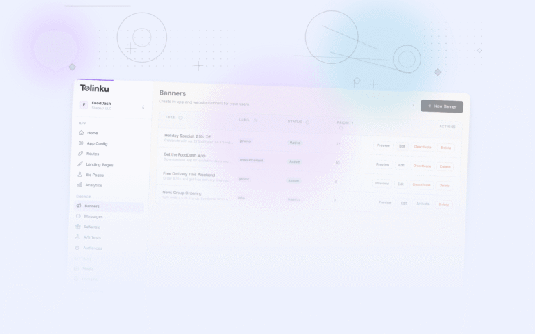
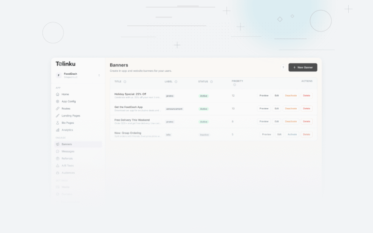
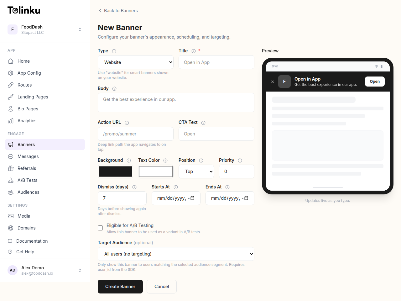 The banner creation form with title, body, colors, CTA, scheduling, and live preview.
1. Lead With a Benefit, Not a Command
The most common mistake in banner copy is defaulting to generic commands: "Download App," "Get the App," "Open in App." These phrases say nothing about why the user should bother.
Better copy answers a specific question: "What do I get from this?" Compare:
- Generic: "Get the App"
- Specific: "Shop 20% faster in the app"
- Specific: "See your delivery in real-time"
- Specific: "Exclusive app-only deals inside"
The benefit does not have to be elaborate. It just needs to be concrete and relevant to what the user is doing on the page. A user reading a recipe on your cooking app's website responds better to "Cook along with hands-free mode" than to "Download the App."
Keep copy under 40 characters for the CTA button itself. Longer text either wraps awkwardly or gets cut off on narrow screens. For the subtitle line below the app name, you have more room: 50-60 characters works well.
2. Color Contrast and Button Visibility
The CTA button is the most important element in the banner. It needs to be immediately visible against the banner background.
WCAG 2.1 Level AA requires a contrast ratio of at least 4.5:1 for normal text and 3:1 for large text. Apply the same standard to your banner button text against its background. Anything below that threshold loses users with low vision and often looks weak even to fully sighted users on a bright phone screen in sunlight.
Practical rules:
- White text on a brand-colored button works well if the brand color has a luminance below 0.3
- Avoid light gray buttons: they read as disabled
- The button's color should be visually distinct from the banner background (do not use the same hue for both)
A common pattern is a white banner background with a solid brand-color button. This creates immediate visual hierarchy without requiring the user to parse much.
3. App Icon: Show It, Size It Right
The app icon serves as instant brand recognition. Users who already have the app see the icon and know immediately what you are promoting. Users who do not have it yet get a visual anchor.
Sizing guidelines:
- Display at 40×40 points (80x80px at 2x) for banner use
- Use the actual app store icon, not a modified version
- Apply a border radius of 9px (matching the iOS icon grid) for iOS-context banners
Do not skip the icon to save space. Testing consistently shows banners with the app icon outperform text-only designs. The icon adds visual weight to the left side of the banner, which creates a natural reading flow toward the CTA button on the right.
Apple's Human Interface Guidelines specify that app icons should not include text overlays or use rounded corners that differ from the system's corner radius. Keep your promotional icon consistent with your store icon.
4. Dismiss Behavior: Make It Easy
Counterintuitively, making it easy to dismiss a banner improves conversion rates over time. Here is why: when users feel trapped by a banner they cannot easily close, they learn to resent it. They dismiss it faster the next time they see it, often before reading any content. They also associate that friction with your brand negatively.
A well-placed close button (typically top-left or top-right, 24×24 touch target minimum) respects the user's choice. The Nielsen Norman Group consistently finds that giving users clear exit paths increases trust in the UI.
For dismiss persistence: store the dismissal in localStorage with a timestamp. Seven days is a reasonable default. Users who dismissed two months ago and have forgotten about the app are worth re-engaging. Users who dismissed yesterday are not.
Do not show the banner again immediately on the next page view. A user who dismisses on the homepage and then navigates to a product page should not see the banner again in the same session.
5. Mobile-First Layout
The banner exists for mobile users, so design for the smallest supported screen first. A 320px wide viewport is the lower bound for most current mobile devices.
At that width, the banner needs to fit:
- A close button (24×24 tap target minimum, per Google's touch target guidelines)
- An app icon (40×40)
- At least a short app name
- A CTA button
That is tight. Two strategies work well:
Option A: Hide the subtitle at small sizes. Keep the title and CTA, drop the subtitle below 360px. The subtitle is helpful context but not essential.
Option B: Stack the text vertically. Put the title on one line and the subtitle below it, both in a flex column. This keeps content readable without requiring truncation.
Never truncate the CTA button text. If the button text gets cut off, the user loses the primary action. Instead, shorten the copy or adjust the layout.
6. Typography and Spacing
Use the device's system font stack where possible. System fonts render faster (no web font download required), look native to the platform, and respect the user's accessibility font size settings.
font-family: -apple-system, BlinkMacSystemFont, "Segoe UI", Roboto, sans-serif;
Minimum font sizes:
- App name / title: 14px
- Subtitle: 12px
- CTA button: 13px (but bold, so it reads at size)
Line height: 1.3-1.4 for the subtitle text. Tighter line height at small sizes reduces readability.
Padding inside the banner: 10-12px top and bottom is the standard. Less than 8px feels cramped. More than 16px makes the banner visually heavy and takes up too much screen real estate.
7. Timing the Appearance
A banner that fires instantly when the page loads interrupts the user before they have read anything. A banner that fires after 30 seconds may appear after the user has already decided to stay on the web page.
A delay of 1.5 to 3 seconds after page load works well for most sites. This gives the user time to register what page they are on before the banner competes for attention.
Scroll-triggered appearance is another option: show the banner after the user has scrolled 25-30% of the page. This implies intent to engage with the content and reduces accidental dismissals from users who are still orienting.
Tolinku's display behavior settings let you configure both time-delay and scroll-trigger without writing custom code.
8. Designing for Dark Mode
iOS and Android both support system dark mode. If your banner uses a hardcoded white background, it will flash uncomfortably on phones with dark mode enabled.
Use the CSS prefers-color-scheme media query:
@media (prefers-color-scheme: dark) {
  .tolk-banner {
    background: #1c1c1e;
    color: #ffffff;
  }
  .tolk-banner__subtitle {
    color: #ababab;
  }
  .tolk-banner__close {
    color: #636366;
  }
}
Your CTA button color may need adjustment in dark mode. A vibrant blue that reads well on white can look oversaturated against a dark background. Test on both.
9. What A/B Tests Consistently Show
When teams run controlled tests on banner variants, a few patterns show up repeatedly:
Benefit-driven CTA copy outperforms action verbs. "Track your order" outperforms "Open App" in e-commerce contexts by a wide margin in most tests.
Rounded-rectangle CTA buttons outperform square buttons. Pill shapes (high border-radius) also work well on iOS where users are accustomed to that style. Square buttons can read as less interactive.
Bottom banners match or beat top banners on Android. On devices where the back button or home gesture is at the bottom, users' thumbs are already in that zone.
Stars and ratings in the subtitle add credibility. "Rated 4.8 on the App Store" adds social proof in a small space and can lift CTR noticeably.
Single-line banners outperform two-line banners on very small screens. The cognitive load of reading two lines of text on a 320px screen reduces tap rate.
See the Tolinku A/B testing documentation for how to set up controlled tests across banner variants, and read the A/B testing deep links guide for the broader testing methodology.
10. Accessibility as a Design Constraint
Accessible design is not a separate concern from conversion design. Banners that are hard to dismiss, have low contrast, or cannot be navigated by keyboard or screen reader also tend to perform worse with the general population.
Checklist:
- Close button has
aria-label="Dismiss banner"or equivalent - CTA link text is descriptive (not "click here")
- Banner has
role="banner"oraria="region"with a label - All touch targets are at least 24x24px (44x44px preferred)
- Color is not the only way information is conveyed
- Banner can be dismissed with the Escape key for keyboard users
The Tolinku designing guide covers these requirements and shows how the default banner templates are pre-built to meet them.
A banner that follows these principles will not only convert better; it will also fail less often on edge cases: odd screen sizes, unusual user agent strings, accessibility tools, and slow network connections. The goal is a banner that works reliably for every user and earns the tap when the timing is right.
Get deep linking tips in your inbox
One email per week. No spam.