When someone clicks a referral link, they land on a page that has to do one thing: convince them to sign up. That page is not your homepage. It's not your generic app store listing. It's a referral landing page, and it has different requirements than any other page on your site.
Referred visitors are fundamentally different from other traffic. They already have a reason to trust your product (a friend recommended it). They already have an incentive to act (the referral reward). What they need is reassurance that the product is worth their time, and a clear, frictionless path to claim their reward.
This guide covers what makes referral landing pages different, what to include, and how to optimize them. For the general referral program framework, see building referral programs that actually work. For the web-to-app conversion strategy, see the web-to-app conversion guide.
 The referrals page with stats cards, referral list, and leaderboard tabs.
Why Referral Visitors Need Their Own Landing Page
Referred visitors convert at 3-5x the rate of cold traffic, according to research published by the Wharton School. But that higher conversion rate isn't automatic. It's the ceiling, not the floor. A poorly designed landing page wastes the trust advantage that the referral provided.
Here's why a generic page underperforms:
Context loss. The referrer shared a link with context: "Try this app, we both get $10." When the friend clicks and lands on a generic homepage, that context evaporates. The page doesn't mention the referral, the reward, or the friend. The visitor is confused.
Friction mismatch. Your homepage is designed for cold visitors who need to learn about your product from scratch. Referred visitors already have social proof (their friend uses it). They don't need a product tour; they need a signup form and confirmation that their reward is waiting.
Missed personalization. A referral link carries data: who referred them, what reward they're entitled to, and potentially what product features the referrer likes. A generic page can't use any of that data.
Referral-Specific Elements
1. The Referrer's Name
The most important element on the page. Display the referrer's first name prominently:
Sarah invited you to try [Product] Sign up and you both get $10.
This reinforces the social connection and makes the page feel like a personal invitation, not a marketing funnel. Use the referrer data passed through the referral deep link to personalize the page dynamically.
2. The Reward, Front and Center
Don't bury the reward in fine print. The referred user clicked the link because of the reward (and the friend's recommendation). Make it unmissable:
- Large text or a prominent badge showing the reward amount
- Clear conditions: "Get $10 after your first purchase"
- Both sides of the reward: "You get $10. Sarah gets $10."
Showing the referrer's reward creates a sense of reciprocity. The visitor knows their signup benefits their friend, which adds social motivation. For more on structuring double-sided incentives, see the double-sided referral incentives guide.
3. Social Proof (Different Kind)
Generic landing pages use testimonials from strangers. Referral landing pages have something better: the implicit endorsement of the referrer. Lean into it:
- "[Referrer] has been using [Product] for [X months]."
- "[Referrer] is one of [X,000] users who [value proposition]."
If you can pull data about the referrer's usage (without exposing anything private), it adds credibility. "Sarah has used [Product] for 6 months" is more persuasive than "Join 50,000 happy users."
4. Simplified Signup
Remove every unnecessary field. The minimum for a referral signup is:
- Email address (or phone number)
- Password
- Accept terms checkbox
Everything else (name, profile photo, preferences) can wait until after signup. Every additional field reduces conversion. Formstack research consistently shows that reducing form fields increases completion rates.
5. App Store Badges (for Mobile Apps)
If your product is a mobile app, the landing page needs to get the visitor to the app store efficiently. Show platform-appropriate badges:
- iOS user: Show "Download on the App Store" badge
- Android user: Show "Get it on Google Play" badge
- Desktop user: Show both, or a QR code that opens the store on their phone
Tolinku deep links handle this routing automatically. When the visitor clicks through, they're sent to the correct app store, and the referral attribution is preserved through the install via deferred deep linking.
Page Layout
A high-converting referral landing page follows this structure:
┌─────────────────────────────────┐
│         [Product Logo]          │
│                                 │
│   Sarah invited you to try      │
│        [Product Name]           │
│                                 │
│   ┌───────────────────────┐     │
│   │   You both get $10    │     │
│   │   on your first order │     │
│   └───────────────────────┘     │
│                                 │
│   [What the product does in     │
│    one sentence]                │
│                                 │
│   ┌───────────────────────┐     │
│   │   Sign Up and Claim   │     │
│   │      Your $10         │     │
│   └───────────────────────┘     │
│                                 │
│   ✓ Feature 1                   │
│   ✓ Feature 2                   │
│   ✓ Feature 3                   │
│                                 │
│   [App Store] [Google Play]     │
│                                 │
│   Fine print: reward terms      │
└─────────────────────────────────┘
Everything above the fold. No scrolling required for the primary action. Features and secondary content below the fold for visitors who need more convincing.
Technical Implementation
Dynamic Personalization
The referral link carries query parameters (or encoded data) that the landing page uses to personalize the content:
// Extract referral data from the URL
const params = new URLSearchParams(window.location.search);
const referrerName = params.get('ref_name') || 'Your friend';
const rewardAmount = params.get('reward') || '$10';

// Personalize the page
document.getElementById('headline')!.textContent =
  `${referrerName} invited you to try ProductName`;
document.getElementById('reward')!.textContent =
  `You both get ${rewardAmount}`;
For apps using Tolinku referral links, the referral token is embedded in the deep link. When the user installs and opens the app, the SDK retrieves the referral data:
// iOS: Retrieve referral context after install
Tolinku.shared.getDeepLinkData { result in
    if let referrerName = result.data["referrer_name"] as? String {
        // Show personalized welcome: "Sarah invited you!"
        WelcomeViewController.showReferralWelcome(referrerName: referrerName)
    }
}
Platform Detection
Detect the visitor's platform and show the appropriate CTA:
function getPlatform(): 'ios' | 'android' | 'desktop' {
  const ua = navigator.userAgent.toLowerCase();
  if (/iphone|ipad|ipod/.test(ua)) return 'ios';
  if (/android/.test(ua)) return 'android';
  return 'desktop';
}

const platform = getPlatform();
if (platform === 'ios') {
  document.getElementById('ios-badge')!.style.display = 'block';
} else if (platform === 'android') {
  document.getElementById('android-badge')!.style.display = 'block';
} else {
  // Show both badges or QR code
  document.getElementById('ios-badge')!.style.display = 'block';
  document.getElementById('android-badge')!.style.display = 'block';
}
Tolinku handles this platform routing automatically when you use smart deep links, so the landing page can simply link to the Tolinku URL and let the routing logic handle the rest.
Optimization
Page Speed
Referral landing pages should load in under 2 seconds. Referred visitors have intent, but that intent decays quickly. Google's research on mobile page speed shows that bounce rate increases 32% as page load time goes from 1 to 3 seconds.
For a referral landing page, this means:
- No heavy JavaScript frameworks. Static HTML with minimal JS for personalization.
- Optimized images. Compress the product logo and any screenshots.
- CDN delivery. Serve the page from a CDN close to the visitor.
- No third-party scripts that block rendering.
Mobile-First Design
70-80% of referral traffic is mobile (referrals are shared via text, WhatsApp, and social media, which are mobile-first channels). Design the page for mobile screens first:
- Large tap targets (minimum 44x44px for buttons)
- No horizontal scrolling
- Readable text without zooming (minimum 16px body text)
- Single-column layout
Trust Signals
Even with the referrer's endorsement, some visitors need additional reassurance:
- Security badges (SSL, app store verification)
- Privacy statement ("We won't spam you")
- Star ratings from app stores
- Media logos if you've been featured
Keep these below the fold. They're for the hesitant minority, not the primary audience.
What Not to Include
Navigation menus. The landing page has one goal: signup. A navigation menu offers escape routes to your blog, about page, or pricing page, none of which help conversion.
Multiple CTAs. "Sign up" and "Learn more" compete with each other. Remove "Learn more." If someone needs to learn more, they'll scroll down.
Auto-playing videos. They slow the page, consume mobile data, and annoy users. If you need a video, make it click-to-play and place it below the fold.
Long feature lists. Three bullet points are enough. The referrer's recommendation is your strongest selling point; you don't need to oversell.
Measuring Landing Page Performance
Track these metrics for your referral landing page:
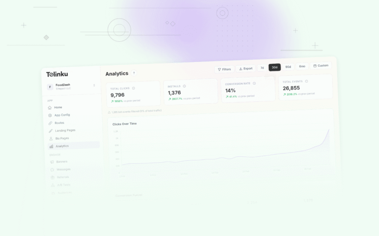
Metric Good Benchmark Notes Conversion rate 25-40% Referred visitors convert much higher than cold traffic Bounce rate < 40% Low because visitors arrive with intent Time to conversion < 60 seconds Referred visitors decide fast Page load time < 2 seconds Critical for mobile Use Tolinku analytics to track click-through rates on referral links to the landing page, and your own analytics tool (Google Analytics, Mixpanel, etc.) for on-page behavior.
For the referral program framework, see building referral programs that actually work. For using landing pages with Tolinku, see the landing pages documentation.
Get deep linking tips in your inbox
One email per week. No spam.