

An attribution dashboard is only useful if it helps someone make a decision. A wall of numbers with every possible metric is worse than no dashboard at all. The best attribution dashboards show the right metrics to the right audience at the right time, and they make it obvious what to do next.
This guide covers how to design attribution dashboards. For deep link analytics, see deep link analytics: measuring what matters. For re-engagement attribution, see re-engagement attribution for mobile apps.
Dashboard Audiences
Different stakeholders need different views:
| Audience | Needs | Cadence |
|---|---|---|
| Marketing team | Campaign performance, channel comparison, budget allocation | Daily |
| Product team | Feature adoption, onboarding completion, deep link usage | Weekly |
| Finance/Leadership | ROI, customer acquisition cost, LTV | Monthly |
| Growth team | Funnel conversion, A/B test results, cohort retention | Daily/Weekly |
| Fraud team | Anomaly detection, invalid traffic, click patterns | Real-time |
Build separate dashboards (or dashboard views) for each audience.
Core Attribution Metrics
Acquisition Metrics
| Metric | Definition | Why It Matters |
|---|---|---|
| Installs | Total app installs (organic + paid) | Volume indicator |
| Organic installs | Installs not attributed to paid campaigns | Baseline growth |
| Paid installs | Installs attributed to ad campaigns | Campaign output |
| Cost per install (CPI) | Ad spend / paid installs | Acquisition efficiency |
| Install-to-registration rate | Users who registered / total installs | Quality indicator |
Engagement Metrics
| Metric | Definition | Why It Matters |
|---|---|---|
| Day 1 retention | % of users active 1 day after install | Early engagement signal |
| Day 7 retention | % of users active 7 days after install | Medium-term engagement |
| Day 30 retention | % of users active 30 days after install | Long-term engagement |
| Sessions per user | Average app opens per user per period | Usage depth |
| Deep link conversion rate | Users who completed the deep link's intended action / total deep link clicks | Link effectiveness |
Revenue Metrics
| Metric | Definition | Why It Matters |
|---|---|---|
| Revenue per install (RPI) | Total revenue / installs (per cohort) | Revenue quality |
| ROAS (Return on Ad Spend) | Revenue / ad spend | Campaign profitability |
| LTV (Lifetime Value) | Projected total revenue per user | Long-term value |
| Payback period | Days until ad spend is recovered in revenue | Cash flow |
| Cost per paying user | Ad spend / users who made a purchase | Conversion efficiency |
Dashboard Layouts
Executive Dashboard
The executive dashboard answers one question: "Is our growth healthy?"
┌──────────────────────────────────────────────────────┐
│ KEY METRICS (THIS MONTH vs LAST MONTH)               │
│ ┌─────────┐ ┌─────────┐ ┌─────────┐ ┌─────────────┐ │
│ │ Installs│ │  CPI    │ │  ROAS   │ │ 30-Day LTV  │ │
│ │ 45,200  │ │ $2.80   │ │ 180%    │ │ $12.50      │ │
│ │ +12%    │ │ -8%     │ │ +15%    │ │ +5%         │ │
│ └─────────┘ └─────────┘ └─────────┘ └─────────────┘ │
├──────────────────────────────────────────────────────┤
│ CHANNEL BREAKDOWN          │ ORGANIC vs PAID TREND    │
│ [Stacked bar chart]        │ [Line chart, 90 days]    │
│ - Search: 35%              │                          │
│ - Social: 28%              │                          │
│ - Display: 15%             │                          │
│ - Organic: 22%             │                          │
├────────────────────────────┴─────────────────────────┤
│ RETENTION COHORTS (HEATMAP)                          │
│ Week 1: 65% | Week 2: 45% | Week 4: 30% | Week 8:  │
│ 22%                                                  │
└──────────────────────────────────────────────────────┘
Campaign Manager Dashboard
The campaign manager dashboard answers: "Which campaigns should I scale, optimize, or cut?"
┌──────────────────────────────────────────────────────┐
│ CAMPAIGN PERFORMANCE TABLE (sortable)                │
│ Campaign  │ Spend  │ Installs │ CPI  │ ROAS │ D7 Ret│
│ FB-Search │ $5,200 │ 2,100    │$2.48 │ 210% │ 42%   │
│ GG-UAC   │ $8,100 │ 3,400    │$2.38 │ 195% │ 38%   │
│ TT-Video │ $3,500 │ 1,800    │$1.94 │ 165% │ 35%   │
│ Snap-AR  │ $1,200 │   400    │$3.00 │ 120% │ 28%   │
├──────────────────────────────────────────────────────┤
│ DAILY SPEND vs INSTALLS    │ CPI TREND BY CHANNEL    │
│ [Dual axis line chart]     │ [Line chart, 30 days]   │
├────────────────────────────┴─────────────────────────┤
│ GEO PERFORMANCE            │ CREATIVE PERFORMANCE    │
│ [Map or table by country]  │ [Table by creative ID]  │
└──────────────────────────────────────────────────────┘
Deep Link Analytics Dashboard
Specific to deep link performance:
┌──────────────────────────────────────────────────────┐
│ DEEP LINK CLICKS (THIS WEEK)                         │
│ ┌──────────┐ ┌──────────┐ ┌──────────┐ ┌──────────┐ │
│ │ Total    │ │ App Open │ │ Web Fall │ │ Store    │ │
│ │ Clicks   │ │ Rate     │ │ back     │ │ Redirect │ │
│ │ 12,400   │ │ 68%      │ │ 22%      │ │ 10%      │ │
│ └──────────┘ └──────────┘ └──────────┘ └──────────┘ │
├──────────────────────────────────────────────────────┤
│ TOP ROUTES BY CLICKS       │ CLICK SOURCES            │
│ /products/savings: 2,100   │ Email: 45%               │
│ /offers/OFFER-123: 1,800   │ Push: 30%                │
│ /dashboard: 1,200          │ Social: 15%              │
│ /referrals: 950            │ QR: 10%                  │
├────────────────────────────┴─────────────────────────┤
│ CONVERSION FUNNEL                                    │
│ Click → App Open → Target Screen → Action Complete   │
│ 12,400 → 8,432 → 7,200 → 3,600                     │
│       68%     85%       50%                          │
└──────────────────────────────────────────────────────┘
Building Effective Visualizations
Choose the Right Chart Type
| Data Type | Best Chart | Avoid |
|---|---|---|
| Trends over time | Line chart | Pie chart |
| Channel comparison | Horizontal bar chart | 3D bar chart |
| Funnel conversion | Funnel diagram | Stacked bar |
| Cohort retention | Heatmap | Line chart (too many lines) |
| Geographic data | Choropleth map | Table with country flags |
| Metric vs target | Gauge or bullet chart | Line chart |
Dashboard Design Principles
- Lead with the decision. Put actionable metrics at the top. "Which campaign should I scale?" not "How many clicks did we get?"
- Show comparisons. A number without context is meaningless. Compare to last period, target, or benchmark.
- Limit to 5-7 key metrics. If everything is highlighted, nothing is highlighted.
- Use consistent time ranges. Do not mix weekly and monthly data on the same dashboard.
- Include filters. Let users drill down by date range, channel, country, and platform (iOS/Android).
Real-Time vs Batch Dashboards
| Aspect | Real-Time | Batch (Daily/Weekly) |
|---|---|---|
| Use case | Fraud detection, launch monitoring | Performance reporting, trend analysis |
| Data freshness | Seconds to minutes | Hours to days |
| Infrastructure cost | Higher (streaming) | Lower (scheduled queries) |
| Accuracy | May include incomplete data | Complete data for the period |
Most attribution dashboards should be batch (daily refresh). Real-time dashboards are only necessary for fraud monitoring and campaign launches.
Common Mistakes
- Too many metrics. A dashboard with 50 metrics is a spreadsheet, not a dashboard.
- Vanity metrics. Impressions and clicks look good but do not indicate business impact.
- No benchmarks. "CPI is $3.00" means nothing without knowing if that is good or bad.
- Ignoring organic. A campaign that increases paid installs but cannibalizes organic is not truly growing the business.
- Single-touch reporting. Reporting only last-click attribution ignores the full user journey.
- No cohort analysis. Aggregate metrics hide whether quality is improving or declining over time.
Tolinku Analytics Dashboard
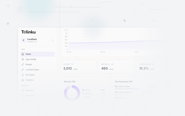
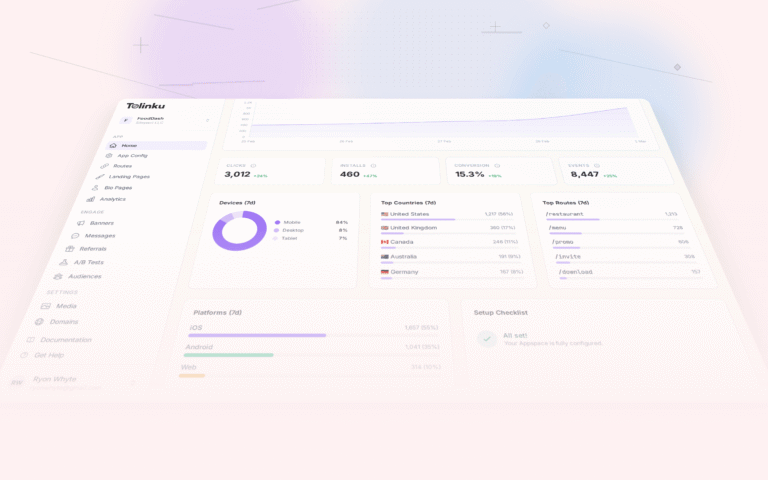
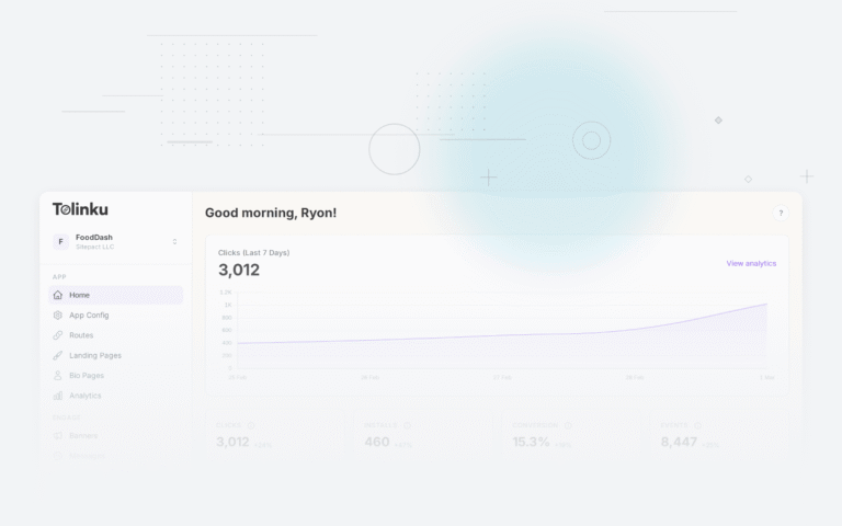
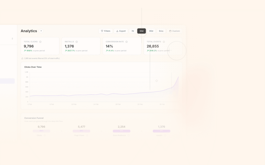
Tolinku's analytics dashboard provides deep link click tracking, conversion funnels, and attribution data out of the box. View clicks by route, source, platform, and time period. Configure custom charts and funnels in the Tolinku dashboard.
For mobile attribution, see mobile attribution: a developer's guide. For deep link analytics, see deep link analytics: measuring what matters.
Get deep linking tips in your inbox
One email per week. No spam.