

A table of 10,000 rows tells you nothing. A line chart showing a 40% drop in app open rates on Tuesday tells you exactly when something broke. Visualization turns deep link data into decisions. But the wrong chart type obscures the insight you are trying to communicate.
This guide covers how to visualize deep link analytics. For dashboard design, see real-time analytics dashboards for deep links. For the full analytics overview, see deep link analytics: measuring what matters.
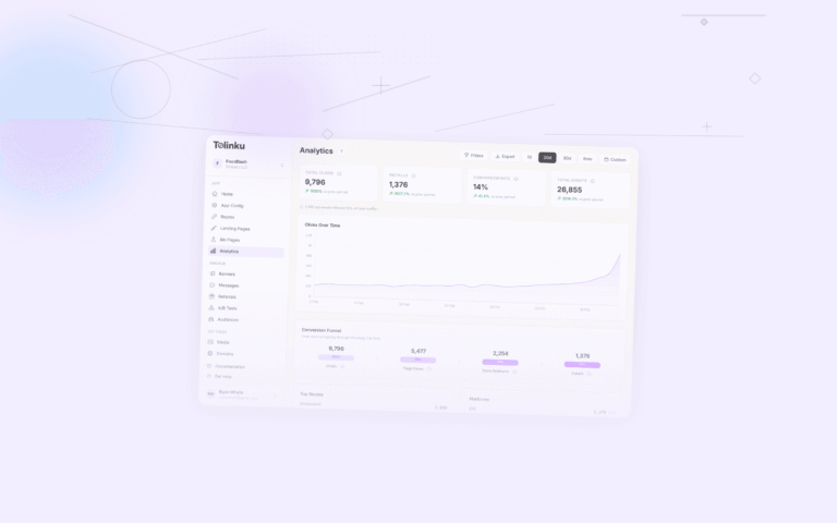
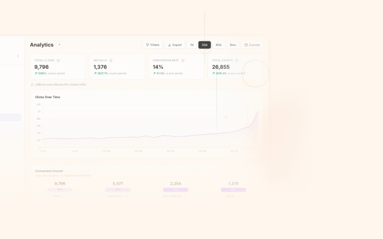
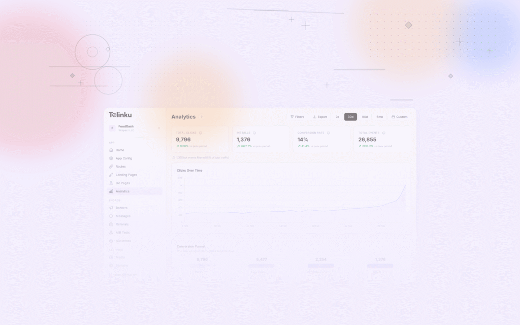
 The clicks over time line chart from the analytics page with date range controls.
Choosing the Right Chart Type
Chart Types for Deep Link Data
| Data Type | Best Chart | Why |
|---|---|---|
| Trend over time (clicks, conversions) | Line chart | Shows direction and rate of change |
| Channel comparison (clicks by source) | Bar chart (horizontal) | Easy to compare categories |
| Funnel (click to conversion) | Funnel chart | Shows drop-off at each stage |
| Distribution (clicks by country) | Choropleth map | Geographic patterns at a glance |
| Composition (iOS vs Android share) | Stacked bar or donut | Shows parts of a whole |
| Correlation (clicks vs conversions) | Scatter plot | Reveals relationships between metrics |
| Single metric (today's conversion rate) | KPI card / big number | Focuses attention on one value |
Common Mistakes
- Pie charts for more than 5 categories. A pie chart with 12 slices is unreadable. Use a horizontal bar chart instead.
- Dual-axis charts. Two y-axes create ambiguity. Use separate charts or normalize the data.
- 3D charts. They distort proportions and add no information. Always use 2D.
- Truncated y-axis. Starting the y-axis at a non-zero value exaggerates small changes. Only truncate when the audience understands the context.
- Too many lines on one chart. More than 4-5 lines becomes spaghetti. Highlight the 2-3 most important and group the rest as "other."
Core Visualizations
Click Trend Line
The most basic and most useful chart: clicks over time.
Daily Deep Link Clicks (July 2026)

Clicks
5,000 |                          ●
4,500 |              ●  ●       ● ●
4,000 |         ●  ●    ●  ●       ●
3,500 |    ●  ●                      ●
3,000 |  ●                              ●
2,500 |●                                  ●  (weekend drop)
      └────────────────────────────────────────
       1   3   5   7   9  11  13  15  17  19  21
Add annotations for events (campaign launches, configuration changes, outages) so the audience understands why the line moved.
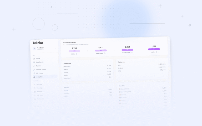
Conversion Funnel
Show the drop-off at each stage:
Email Campaign "Summer Sale" Funnel

  Email Sent          ████████████████████████████████████████  50,000 (100%)
  Email Opened        ████████████████████████                  30,000 (60%)
  Link Clicked        ████████████████                          18,000 (36%)
  App Opened          ████████████                              14,400 (29%)
  Target Screen       ███████████                               13,200 (26%)
  CTA Tapped          ██████                                     6,600 (13%)
  Converted           ████                                       2,050 (4.1%)
The biggest relative drop is "CTA Tapped to Converted" (31%). But the biggest absolute drop is "Email Sent to Email Opened" (20,000 users lost). Focus optimization on the stage with the largest absolute loss.
Channel Comparison
Horizontal bar chart comparing channels:
Conversions by Channel (July 2026)

  Email           ████████████████████████████████████  2,050
  Push            ██████████████████████                1,200
  Organic Social  ████████                                450
  Paid Social     █████                                   280
  QR Codes        ███                                     120
Sort by the metric you want to emphasize (conversions, ROAS, CPA). Do not sort alphabetically.
Platform Distribution
Donut chart or stacked bar showing iOS vs Android:
Click Distribution by Platform

  ┌──────────────────────────┐
  │  iOS      55%  ████████  │
  │  Android  40%  ██████    │
  │  Desktop   5%  █         │
  └──────────────────────────┘
Dashboard Layout
Executive Dashboard
An executive dashboard should fit on one screen and answer: "Are we on track?"
┌─────────────────────────────────────────────────────┐
│  DEEP LINK PERFORMANCE: JULY 2026                    │
├──────────┬──────────┬──────────┬──────────┬─────────┤
│  Clicks  │  Opens   │  Conv.   │  Revenue │  ROAS   │
│  45,200  │  32,500  │  4,100   │  $82,000 │  234%   │
│  +12%    │  +8%     │  +15%    │  +18%    │  +14%   │
├──────────┴──────────┴──────────┴──────────┴─────────┤
│  [Click Trend Line Chart - 30 days]                  │
├────────────────────────┬────────────────────────────┤
│  [Channel Bar Chart]   │  [Conversion Funnel]        │
├────────────────────────┼────────────────────────────┤
│  [Top 5 Campaigns]     │  [Platform Donut]           │
└────────────────────────┴────────────────────────────┘
Rules for executive dashboards:
- One screen, no scrolling.
- KPI cards at the top with trend indicators (up/down arrows, % change).
- 4-6 charts maximum.
- Comparison to previous period or target on every metric.
Operations Dashboard
An operations dashboard monitors real-time health:
┌─────────────────────────────────────────────────────┐
│  DEEP LINK HEALTH: REAL-TIME                         │
├──────────┬──────────┬──────────┬──────────┬─────────┤
│  Open    │  Fallback│  Error   │  Avg     │  P99    │
│  Rate    │  Rate    │  Rate    │  Latency │ Latency │
│  72%  ✓  │  22%  ✓  │  0.3% ✓  │  320ms ✓ │  890ms ⚠│
├──────────┴──────────┴──────────┴──────────┴─────────┤
│  [Open Rate - Last 24h, by hour]                     │
├────────────────────────┬────────────────────────────┤
│  [Errors by Route]     │  [Latency Distribution]     │
├────────────────────────┼────────────────────────────┤
│  [Platform Open Rates] │  [Recent Alerts]             │
└────────────────────────┴────────────────────────────┘
Use traffic lights (green/yellow/red) or status indicators for threshold-based metrics.
Advanced Visualizations
Cohort Heatmap
A retention heatmap shows how cohorts perform over time:
Retention Heatmap (% returning)

              Day 1   Day 7   Day 14  Day 30
Week 1 (Jun)   38%     18%     12%     8%
Week 2 (Jun)   40%     20%     14%     9%
Week 3 (Jul)   42%     22%     15%    10%
Week 4 (Jul)   45%     24%      -      -

Color: Dark green (high) → Yellow → Red (low)
This format quickly reveals whether retention is improving week over week.
Sankey Diagram
A Sankey diagram shows how traffic flows through your deep link ecosystem:
Source          →  Outcome         →  Action
─────────────────────────────────────────────
Email (18K)    ──→ App Open (14K)  ──→ Convert (2K)
               ──→ Fallback (3K)  ──→ Web Convert (300)
               ──→ Store (1K)     ──→ Install (400)

Push (15K)     ──→ App Open (12K) ──→ Convert (1.2K)
               ──→ Error (200)

Social (5K)    ──→ App Open (3K)  ──→ Convert (450)
               ──→ Fallback (1.5K)
               ──→ Store (500)
Sankey diagrams are complex but powerful for understanding flow distribution. Use them in monthly or quarterly reports, not daily dashboards.
Geographic Heatmap
Show clicks or conversions on a map:
interface MapDataPoint {
  country: string;
  value: number;
  metric: 'clicks' | 'conversions' | 'open_rate';
}

function buildMapVisualization(data: MapDataPoint[]) {
  // Choropleth map with color intensity based on value
  const maxValue = Math.max(...data.map(d => d.value));

  return data.map(point => ({
    ...point,
    intensity: point.value / maxValue,
    color: getColorScale(point.value / maxValue) // green to red
  }));
}
Design Principles
Color
- Use a consistent color palette across all charts.
- Reserve red for negative/bad, green for positive/good.
- Use color to highlight, not decorate. One accent color for the key data series, muted colors for context.
- Ensure sufficient contrast for accessibility (WCAG AA minimum).
Typography
- Dashboard titles: 18-24px, bold.
- KPI numbers: 28-36px, bold.
- Chart labels: 12-14px, regular.
- Annotations: 11-12px, italic or muted color.
Data Density
Edward Tufte's principle: maximize the data-ink ratio. Remove gridlines, borders, and decorations that do not convey information.
- Remove chart borders and backgrounds.
- Use light gridlines or none at all.
- Label data points directly instead of using a separate legend when possible.
- Remove axis labels if the meaning is obvious from context.
Implementation
Building with Chart Libraries
Popular charting libraries for deep link dashboards:
| Library | Language | Best For |
|---|---|---|
| Chart.js | JavaScript | Simple, quick dashboards |
| D3.js | JavaScript | Custom, complex visualizations |
| Recharts | React | React-based dashboards |
| Apache ECharts | JavaScript | Feature-rich, interactive |
| Plotly | Python/JS | Data science, exploration |
Example: Trend Chart with Recharts
import { LineChart, Line, XAxis, YAxis, Tooltip, ResponsiveContainer } from 'recharts';

function ClickTrendChart({ data }: { data: { date: string; clicks: number; conversions: number }[] }) {
  return (
    <ResponsiveContainer width="100%" height={300}>
      <LineChart data={data}>
        <XAxis dataKey="date" />
        <YAxis />
        <Tooltip />
        <Line type="monotone" dataKey="clicks" stroke="#3b82f6" strokeWidth={2} />
        <Line type="monotone" dataKey="conversions" stroke="#10b981" strokeWidth={2} />
      </LineChart>
    </ResponsiveContainer>
  );
}
Tolinku for Analytics Visualization
Tolinku's analytics include built-in charts and funnels for deep link performance data. View click trends, channel comparisons, and conversion funnels in the Tolinku dashboard.
For campaign reporting, see campaign performance reports for deep links. For real-time dashboards, see real-time analytics dashboards for deep links.
Get deep linking tips in your inbox
One email per week. No spam.