Mobile users and desktop users behave differently. They tap instead of click. They scroll vertically instead of scanning horizontally. They have smaller screens, shorter sessions, and completely different expectations for what happens when they follow a link. Running the same A/B test across both device types without acknowledging these differences produces misleading results.
If you're new to A/B testing deep links, start with A/B Testing Deep Links and Landing Pages for the fundamentals. This guide focuses specifically on designing, running, and analyzing experiments that account for the gap between mobile and desktop experiences.
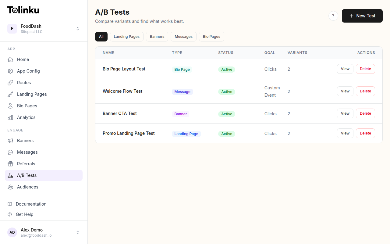 The A/B tests list page showing test names, status, types, and variant counts.
Why Mobile and Desktop Experiences Differ Fundamentally
The deep link journey on mobile and desktop follows entirely different paths. On mobile, a deep link can open a native app, trigger an app install flow, show a smart banner, or fall back to a mobile web page. On desktop, the same link typically resolves to a web page, because most desktop operating systems don't support app-level deep linking the way iOS and Android do.
This means you're not just testing one experience with two screen sizes. You're testing two separate funnels.
| Dimension | Mobile | Desktop |
|---|---|---|
| Primary destination | Native app (if installed) | Web page |
| Fallback behavior | App store, mobile web, or smart banner | Web page (no fallback needed) |
| Session duration | Shorter (avg 3-5 min) | Longer (avg 6-12 min) |
| Interaction model | Touch, swipe, scroll | Mouse, keyboard, hover |
| Screen real estate | Limited (320-430px width) | Expansive (1024px+) |
| Intent signal | Often higher (tapping a link on a phone is deliberate) | Mixed (tabs stay open, lower urgency) |
| Deep link support | Universal Links, App Links | Limited (custom protocols only) |
These differences affect every metric you measure. A desktop conversion rate of 4% and a mobile conversion rate of 2% don't mean desktop is better. They mean the funnels are different, and you need to test them independently to improve each one.
What to Test Differently on Each Platform
Mobile-Specific Tests
On mobile, the biggest optimization opportunities involve the transition between web and app. Test these variables:
App open vs. web fallback: When the user has the app installed, should the deep link always open the app? Or are there cases where a mobile web experience converts better (for example, a quick checkout flow that doesn't require app context)?
Smart banner design: The banner that prompts users to install or open the app is a critical conversion point. Test CTA text ("Open in App" vs. "Continue in App" vs. "Get the Full Experience"), banner position (top vs. bottom), and timing (immediate vs. after 3 seconds of scrolling). Tolinku's A/B testing feature lets you run these tests directly on your deep link routes.
Fallback page layout: Users without the app land on a fallback page. On mobile, vertical layouts with a single prominent CTA outperform pages with multiple options. Test single-CTA vs. multi-option layouts, above-the-fold content, and the presence or absence of app store badges.
Deferred deep linking flow: Test whether preserving the user's intended destination through the install flow (deferred deep linking) improves activation compared to dropping them on the app's home screen.
Desktop-Specific Tests
Desktop testing focuses on the web experience, since native app deep linking is rarely available:
Page layout and density: Desktop users expect more information. Test compact layouts vs. spacious designs, sidebar navigation vs. full-width content, and multi-column vs. single-column product displays.
CTA placement: Desktop users scan in an F-pattern. Test CTAs in the hero section vs. after social proof vs. in a sticky header. Desktop users are more likely to scroll and compare before acting, so a CTA that appears after value demonstration may outperform one that leads with it.
Cross-device handoff: Many desktop users discover content at their desk but want to continue on mobile. Test adding QR codes or "Send to Phone" options on desktop landing pages.
Implementing Device-Specific A/B Tests
Device Detection and Variant Assignment
The first step is reliable device detection. User agent parsing handles most cases, but you should combine it with viewport information for accuracy:
function getDeviceType(userAgent, screenWidth) {
  const ua = userAgent.toLowerCase();

  // Check for mobile indicators in user agent
  const mobileUA = /android|webos|iphone|ipad|ipod|blackberry|iemobile|opera mini|mobile/i.test(ua);

  // Tablets: mobile UA but wider screen
  if (mobileUA && screenWidth && screenWidth >= 768) {
    return 'tablet';
  }

  if (mobileUA) {
    return 'mobile';
  }

  return 'desktop';
}
Once you know the device type, assign variants using a bucketing function that includes the device type as part of the experiment key. This ensures mobile and desktop users are in separate experiments:
import { createHash } from 'crypto';

function assignDeviceVariant(userId, experimentId, deviceType, variants) {
  // Include device type in the hash input so mobile and desktop
  // users are bucketed independently
  const hashInput = `${experimentId}:${deviceType}:${userId}`;
  const hash = createHash('md5').update(hashInput).digest('hex');
  const bucket = parseInt(hash.substring(0, 8), 16) / 0xffffffff;

  let cumulative = 0;
  for (const variant of variants) {
    cumulative += variant.weight;
    if (bucket < cumulative) {
      return variant;
    }
  }

  return variants[variants.length - 1];
}
Configuring Device-Specific Experiments
Structure your experiments so each device type has its own variant set. A mobile CTA test and a desktop layout test are separate experiments, even if they run on the same deep link route:
const experiments = {
  mobile_cta_text: {
    id: 'mobile_cta_text_v2',
    deviceTypes: ['mobile'],
    variants: [
      { id: 'control', weight: 0.5, cta: 'Open in App' },
      { id: 'variant_a', weight: 0.5, cta: 'Continue in App' },
    ],
    primaryMetric: 'app_open_rate',
  },

  desktop_layout: {
    id: 'desktop_layout_v1',
    deviceTypes: ['desktop'],
    variants: [
      { id: 'control', weight: 0.5, layout: 'single_column' },
      { id: 'variant_a', weight: 0.5, layout: 'two_column_with_sidebar' },
    ],
    primaryMetric: 'signup_rate',
  },

  // Cross-device test: same experiment, different rendering
  fallback_page: {
    id: 'fallback_page_v3',
    deviceTypes: ['mobile', 'desktop'],
    variants: [
      { id: 'minimal', weight: 0.5, style: 'single_cta' },
      { id: 'detailed', weight: 0.5, style: 'feature_list_with_cta' },
    ],
    primaryMetric: 'conversion_rate',
  },
};

function getExperimentsForDevice(deviceType) {
  return Object.values(experiments).filter(
    (exp) => exp.deviceTypes.includes(deviceType)
  );
}
Tracking Events by Device Type
Every event you log should include the device type as a property. This lets you segment results during analysis even for experiments that run across both platforms:
function trackExperimentEvent(eventName, properties) {
  const deviceType = getDeviceType(navigator.userAgent, window.innerWidth);

  const event = {
    name: eventName,
    timestamp: Date.now(),
    deviceType,
    experimentId: properties.experimentId,
    variantId: properties.variantId,
    ...properties,
  };

  // Send to your analytics backend
  fetch('/v1/events', {
    method: 'POST',
    headers: { 'Content-Type': 'application/json' },
    body: JSON.stringify(event),
  });
}

// Track variant assignment
trackExperimentEvent('experiment_exposure', {
  experimentId: 'mobile_cta_text_v2',
  variantId: 'variant_a',
});

// Track conversion
trackExperimentEvent('conversion', {
  experimentId: 'mobile_cta_text_v2',
  variantId: 'variant_a',
  conversionType: 'app_open',
});
Analyzing Results by Device Type
When you analyze cross-device experiments, never pool mobile and desktop results. A variant that wins overall might be losing on mobile and winning on desktop (or the reverse). This is Simpson's paradox in practice, and it can lead you to ship a change that hurts your largest user segment.
Segmented Analysis
Break every experiment report into device-level segments:
| Metric | Mobile Control | Mobile Variant | Desktop Control | Desktop Variant |
|---|---|---|---|---|
| Impressions | 12,400 | 12,600 | 8,200 | 8,100 |
| Clicks | 1,488 (12.0%) | 1,638 (13.0%) | 574 (7.0%) | 535 (6.6%) |
| Conversions | 298 (2.4%) | 376 (3.0%) | 246 (3.0%) | 243 (3.0%) |
| Revenue/user | $1.82 | $2.15 | $3.40 | $3.38 |
In this example, the variant significantly improves mobile conversions (+25%) but has no effect on desktop. If you only looked at the aggregate numbers, the improvement would appear smaller and the decision less clear.
Tolinku's analytics dashboard provides device-level breakdowns for all A/B test results, so you can spot these patterns without manual segmentation.
Sample Size Considerations
Mobile and desktop traffic volumes are rarely equal. If 75% of your traffic is mobile and 25% is desktop, your desktop experiments will take three times longer to reach statistical significance. Plan for this by:
- Running longer test durations for the lower-traffic device type
- Using a larger minimum detectable effect (MDE) for the lower-traffic segment
- Considering whether the desktop segment is large enough to justify a separate test at all
Cross-Device Attribution Challenges
Users don't stay on one device. Someone might click your deep link on their phone during a commute, then complete the purchase on their laptop at home. If your A/B test only tracks single-device journeys, you'll undercount conversions for the device where discovery happened and overcount them for the device where the transaction completed.
Strategies for Cross-Device Tracking
Authenticated users: If the user is logged in on both devices, you can connect their sessions. This is the most reliable method, but it only works for users who have accounts and are signed in.
Probabilistic matching: For anonymous users, you can use signals like IP address, browser fingerprint, and timing patterns to estimate cross-device connections. This is less precise but covers a larger share of your traffic. Be mindful of privacy regulations like GDPR and CCPA when using probabilistic methods.
Self-reported handoff: Adding "Send this link to my phone" or "Continue on desktop" features creates an explicit cross-device connection. These events give you clean attribution data for users who cross devices intentionally.
Best Practices
Run device-specific experiments. Don't run one test and hope the results apply to both platforms. Mobile and desktop users have different behaviors, different funnels, and different conversion paths. Test each independently.
Set device type at assignment time. Record the device type when the variant is assigned, not when the conversion happens. A user who sees the mobile variant but later converts on desktop should still be counted in the mobile cohort.
Test the fallback experience on mobile. The fallback page (shown when the app isn't installed) is often the highest-leverage test on mobile. Even small improvements in the install prompt can move conversion rates significantly.
Account for tablet users. Tablets fall between mobile and desktop in screen size and behavior. Decide whether to group them with mobile, group them with desktop, or exclude them from both experiments. Pick one approach and be consistent.
Watch for interaction effects. If you're running a mobile CTA test and a desktop layout test simultaneously, make sure they don't share any pages or components. Overlapping experiments contaminate each other's results.
Prioritize by traffic share. If 80% of your deep link clicks come from mobile, optimize mobile first. A 10% improvement on mobile is worth more than a 30% improvement on desktop in absolute terms.
Document device-specific winners. When you find that a variant wins on mobile but not desktop (or vice versa), implement the change only for the winning platform. Your deep link routing can serve different experiences based on device type without any compromise.
A/B testing mobile and desktop deep link experiences separately is more work than running a single test. But the results are more actionable, more accurate, and more likely to produce real improvements for your users. Start with the platform where you have the most traffic, run a focused test on the highest-impact variable, and let the data guide your next experiment.
Get deep linking tips in your inbox
One email per week. No spam.