Where you place your smart banner on the page affects both conversion rates and user experience. A top banner is highly visible but pushes content down. A bottom banner is less intrusive but easier to ignore. A floating banner follows the user as they scroll but can feel aggressive. Each position has tradeoffs, and the right choice depends on your content type, audience, and goals.
This guide compares the three main banner positions with their UX implications and technical implementation. For banner animations, see animated smart banners. For dismiss behavior, see banner dismiss behavior.
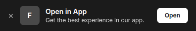 The live banner preview showing how the banner appears on a mobile device.
Position Comparison
| Factor | Top (Fixed/Static) | Bottom (Sticky) | Floating |
|---|---|---|---|
| Visibility | Highest (first thing users see) | Moderate (in peripheral vision) | High (follows scroll) |
| Content disruption | High (pushes content down) | Low (overlays bottom edge) | Moderate (overlays content) |
| Typical CTR | 1.5-3% | 1-2% | 2-4% |
| User annoyance risk | Moderate | Low | High |
| Mobile UX | Can conflict with browser chrome | Good (natural thumb zone) | Can conflict with bottom nav |
| SEO impact | Risky if too large (Google interstitial penalty) | Minimal | Risky if covers content |
Top Position
How It Works
The banner sits at the top of the page, either as a static element (pushes content down) or fixed (overlays the top of the viewport):
/* Static top banner: pushes content down */
.smart-banner--top-static {
  position: relative;
  width: 100%;
  background: #1a1a2e;
  color: white;
  padding: 12px 16px;
  display: flex;
  align-items: center;
  gap: 12px;
}

/* Fixed top banner: overlays content */
.smart-banner--top-fixed {
  position: fixed;
  top: 0;
  left: 0;
  right: 0;
  z-index: 1000;
  background: #1a1a2e;
  color: white;
  padding: 12px 16px;
}

/* When using fixed, add padding to body to prevent content overlap */
body.has-top-banner {
  padding-top: 60px; /* Match banner height */
}
When to Use
- High-priority campaigns where maximum visibility matters.
- First-time visitors who have not seen the banner before.
- Short pages where a bottom banner might not be visible without scrolling.
Considerations
Google's interstitial penalty: Google's page experience guidelines penalize pages with large interstitials that block content on mobile. A top banner that takes up more than ~15-20% of the viewport may be flagged. Keep it slim (50-70px height).
Safari's address bar: On iOS Safari, a fixed top banner can overlap with the browser's address bar, especially during scroll animations. Use env(safe-area-inset-top) to account for this:
.smart-banner--top-fixed {
  top: env(safe-area-inset-top, 0);
  padding-top: max(12px, env(safe-area-inset-top, 0));
}
Apple's native smart banner: If you use Apple's <meta name="apple-itunes-app"> tag, Safari shows its own top banner. Do not show a custom top banner at the same time; the user sees two banners stacked.
Bottom Position
How It Works
The banner sticks to the bottom of the viewport:
.smart-banner--bottom {
  position: fixed;
  bottom: 0;
  left: 0;
  right: 0;
  z-index: 1000;
  background: #1a1a2e;
  color: white;
  padding: 12px 16px;
  padding-bottom: max(12px, env(safe-area-inset-bottom, 0));
  display: flex;
  align-items: center;
  gap: 12px;
}
When to Use
- Content-heavy pages (articles, blog posts) where a top banner would disrupt reading.
- Media apps where the content is the primary experience.
- Pages with existing top navigation that should not be pushed further down.
Considerations
Bottom navigation overlap: Many mobile sites have bottom navigation bars. If the banner covers the navigation, users cannot access menu items:
/* Account for bottom nav */
.smart-banner--bottom {
  bottom: 56px; /* Height of bottom nav */
}

/* Or, if there's no bottom nav, use safe area insets */
.smart-banner--bottom {
  bottom: env(safe-area-inset-bottom, 0);
}
Mobile keyboard: When a text input is focused, the mobile keyboard pushes the viewport up. The bottom banner may jump or overlap with the keyboard. Hide the banner when a keyboard is active:
const inputs = document.querySelectorAll('input, textarea, select');
inputs.forEach(input => {
  input.addEventListener('focus', () => banner.style.display = 'none');
  input.addEventListener('blur', () => banner.style.display = 'flex');
});
Cookie consent overlap: Many sites show cookie consent banners at the bottom. Do not show both simultaneously. Check for a cookie banner before showing your app banner:
function shouldShowBanner() {
  const cookieBanner = document.querySelector('.cookie-consent');
  if (cookieBanner && cookieBanner.offsetParent !== null) {
    return false; // Cookie banner is visible; wait
  }
  return true;
}
Floating Position
How It Works
A floating banner is positioned away from the edges, often as a card or pill shape:
.smart-banner--floating {
  position: fixed;
  bottom: 24px;
  left: 16px;
  right: 16px;
  z-index: 1000;
  background: #1a1a2e;
  color: white;
  padding: 16px;
  border-radius: 12px;
  box-shadow: 0 4px 12px rgba(0, 0, 0, 0.15);
  display: flex;
  align-items: center;
  gap: 12px;
}
When to Use
- High-value conversion moments where you want the banner to stand out from the page.
- Short-duration campaigns (flash sales, limited-time offers) where urgency justifies the visual prominence.
- Pages with minimal content where a floating banner does not overlap with anything important.
Considerations
Content obstruction: Floating banners overlay page content. This is more disruptive than edge-anchored banners because the user cannot predict where the banner ends and the content begins.
Thumb reachability: On large phones, a floating banner near the bottom is in the natural thumb zone (easy to tap). A floating banner near the top requires stretching.
Dismissal UX: Floating banners need a prominent close button. The rounded shape can make the close button harder to notice:
.smart-banner--floating .smart-banner__close {
  position: absolute;
  top: -8px;
  right: -8px;
  width: 24px;
  height: 24px;
  border-radius: 50%;
  background: #fff;
  color: #333;
  border: 1px solid #ddd;
  display: flex;
  align-items: center;
  justify-content: center;
  font-size: 14px;
  cursor: pointer;
}
Responsive Positioning
Desktop vs. Mobile
On desktop, a top banner works well because there is more viewport space. On mobile, a bottom banner is often better because it does not push content below the fold.
/* Desktop: top banner */
@media (min-width: 768px) {
  .smart-banner {
    position: relative;
    top: 0;
  }
}

/* Mobile: bottom sticky banner */
@media (max-width: 767px) {
  .smart-banner {
    position: fixed;
    bottom: 0;
    top: auto;
  }
}
Landscape Mode
On phones in landscape orientation, a full-width banner takes up a significant portion of the limited vertical space. Consider hiding the banner in landscape or using a smaller version:
@media (orientation: landscape) and (max-height: 500px) {
  .smart-banner {
    display: none; /* Too little vertical space */
  }
}
A/B Testing Position
Test different positions to find what works for your specific audience. The key metrics:
- CTR (click-through rate): Which position gets more clicks?
- Dismiss rate: Which position gets dismissed most often?
- Bounce rate impact: Does the banner increase page bounce rate?
- Scroll depth impact: Does the banner affect how far users scroll?
function initBannerWithPosition() {
  const variant = Math.random() < 0.5 ? 'top' : 'bottom';
  const banner = createBanner({ position: variant });
  document.body.appendChild(banner);

  analytics.track('banner_impression', { position: variant });
}
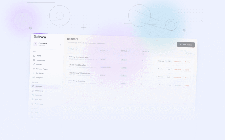
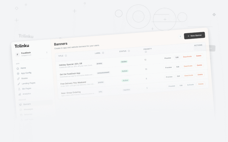
Tolinku Banner Positioning
Tolinku's smart banners support configurable positioning (top, bottom, floating) through the dashboard. The SDK handles safe area insets, cookie banner detection, and responsive behavior automatically.
For animation when the banner appears, see animated smart banners. For dismiss behavior, see banner dismiss behavior. For the complete setup, see the smart banners guide.
Get deep linking tips in your inbox
One email per week. No spam.